Best Fonts For Subtitles in 2024: Top 10 Picks

Skip to the 10 best fonts for subtitles
Have you ever considered how crucial subtitles are for your video’s success? You might be surprised by the number of people who watch videos on mute. Many people rely on default fonts like Arial and Helvetica for subtitles, but exploring other options can enhance the viewing experience. Subtitle fonts play a vital role in ensuring your videos are understandable to a wide audience, offering an enhanced video-watching experience.
By now, you’re probably familiar with the importance of subtitles for your video. Whether it’s for accessibility, convenience, or just a personal preference to have captions turned on are essential.

However, just having subtitles on a video won’t cut it. If you’ve hesitated to add subtitles to your video, we understand.
- You’re probably unsure about where to place your subtitles so they don’t interfere with the content of your video.
- Or you’re worried about what color, size, or style to keep in mind when creating subtitles.
We understand that one size (or style) won’t fit all, so we’ve put together 10 of the best fonts for subtitles to consider for your next video. We’ll also cover the best practices to keep in mind when adding subtitles to your video. Stay tuned as we tackle some FAQs. We talk about fonts used by popular streaming platforms like Netflix and YouTube.
Choosing subtitle fonts: What to look for?
When it comes to subtitles, it’s best to explore how each of these fonts might look and pick one that best reflects your brand vision. Exploring different styles and weights within a font family can help in choosing the best subtitle font. In the end, it’s all about how your subtitles or captions enhance your video content.
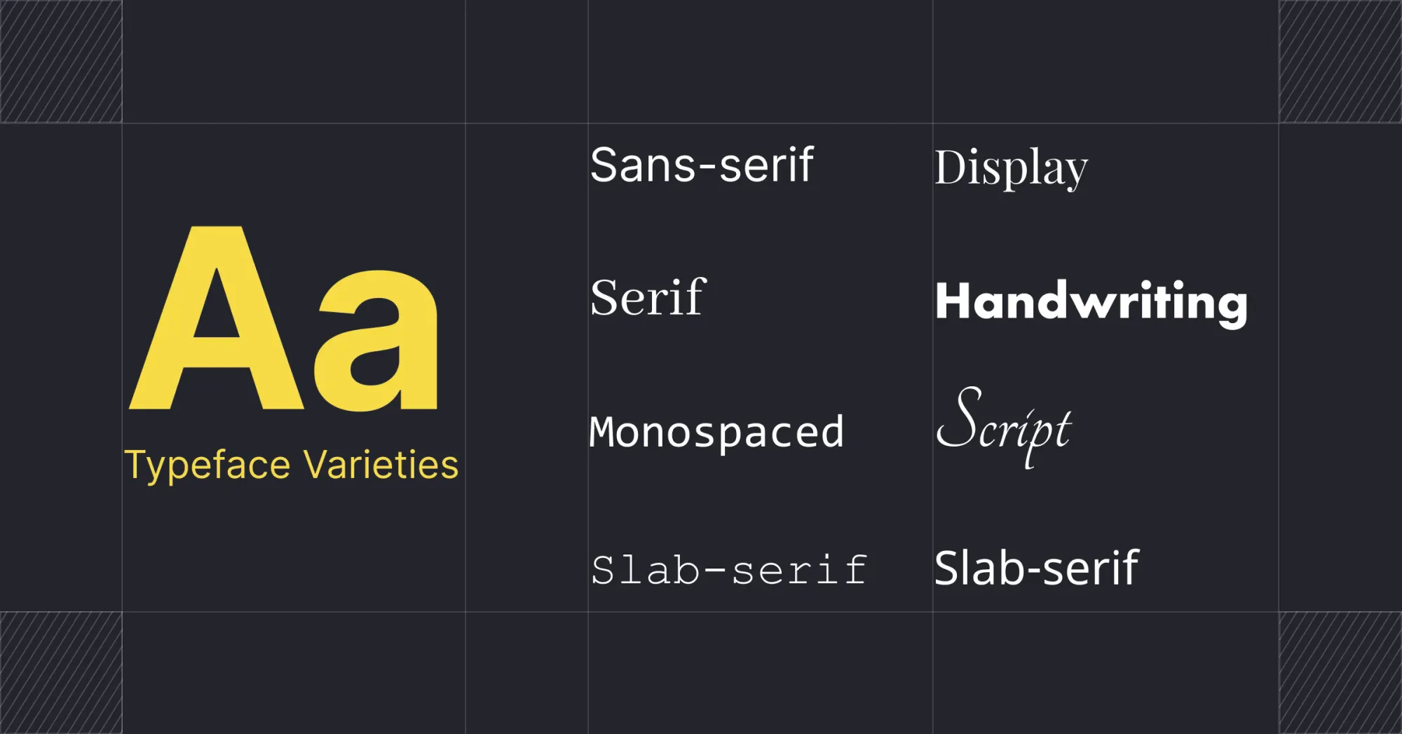
A typeface is a set of letters, numbers, and symbols that share a common design or style. It is the visual representation of written language used in printing and digital media. Typefaces can be classified into various categories based on their characteristics, such as: Serif, Sans Serif, Script, Monospaced, Display.
Subtitle fonts or typefaces have a significant influence on readability. Subtitles and closed captions, whether standard or custom, will contribute to people appreciating your video much more than you think.
Choosing subtitle fonts for your Video: A Checklist
Here's a quick checklist to help you narrow down a font for the subtitles that fits your video well:
1. Is it easy to read? ✓
When choosing a font, consider that viewers will use different devices. Ensure the font is clear both from afar and on small screens.
Serif fonts can be legible for subtitles, but sans-serif fonts like Arial and Verdana are generally more readable than serif fonts like Times New Roman. Different font styles significantly impact readability.

2. Is it blocking your video? ✓
If you want your subtitles to be read easily without taking up too much space on the screen, increase the font size. It's important to strike a balance between size and readability. Avoid using thin or cursive fonts if you want your subtitles to be legible at a smaller font size.
In most cases, a font size between 16 and 24 points works well.

4. Does it stand out? ✓
It's important to ensure that your subtitles stand out from your video. Assuring that the font color stands out clearly against the background of your video is crucial for legibility.
Subtitles with a light hue might be difficult to read on a white or very light backdrop. It might also be difficult to read subtitles if the background of your video has a lot going on or keeps shifting colors.
Consider adding a highlight to your subtitles to ensure they are always visible.

5. Does it complement the tone of your video? ✓
Choose a font that reflects the tone and style of your video content. Custom fonts can enhance branding and aesthetics. For formal videos, use traditional fonts like Times New Roman; for informal videos, opt for modern fonts like Noto Sans.
Experiment with different fonts and sizes to find the best combination. Whether you use a recommended font or your custom brand font, ensure it meets the following checklist for video subtitles.

In general, experiment with different fonts and font sizes to find a combination that works best for you.
Whichever font you pick - whether from our list of recommendations or your own custom brand font, run it through the following checklist to ensure it's compatible with video subtitles.
Closed Vs Open Captions
Although there are many caption formatting options, they often appear as white text in a black box at the top or bottom of your screen. Before diving into the various fonts for captions, here's a bit more information about the differences between popular types of captioning.
- Closed Captions : Closed captions are captions that audience members can enable or disable at will. In order to turn on closed captions, viewers can either use the on-screen [cc] button or their remote control.
- Open Captions : Open captions differ from closed captions because they are permanent fixtures in a video.
The key difference between close captions and open captions lies in their flexibility and accessibility. The flexibility of closed captions enables support for multiple language tracks. In contrast, open captions are permanently visible as part of the video itself, reducing viewer control but ensuring accessibility for those who need it.
Understanding the distinction between these two captioning methods is important for content creators to select the appropriate option based on their needs and their audience's preferences. Close captions offer more customization and viewer choice, while open captions provide a reliable, always-on solution for accessibility, particularly for those who are deaf or hard of hearing.
Serif Fonts Vs Sans Serif Font
What are Serif Fonts?
Serif fonts have small decorative lines or "feet" at the ends of their letters, giving them a classic, formal look linked to tradition and reliability.
- Examples: Times New Roman, Georgia, Garamond
- Appearance: Classic, formal, traditional
Serif fonts offer an elegant appearance, suitable for professional writing. However, they can be harder to read on digital screens at smaller sizes. For videos, consider adding a box around serif text or adjusting letter spacing to enhance readability.
What are Sans Serif Fonts?
Sans serif fonts lack embellishments at the ends of letters, resulting in a cleaner, more modern look that enhances readability on screens.
- Examples: Arial, Helvetica, Calibri
- Appearance: Clean, modern, straightforward
Best for digital media and signage, these fonts convey a contemporary feel and are versatile for various uses.
Choosing the Right Font
Consider the medium and purpose of your content when choosing between serif and sans-serif fonts. Serif fonts are preferred for print due to their readability and classic look.
- Print: Serif fonts enhance readability for long texts.
- Digital: Sans serif fonts provide a clean, modern look.
For branding, serif fonts evoke tradition and reliability, while sans serif fonts suggest modernity and simplicity. Combining serif and sans serif fonts can create a balanced, appealing design, such as using a serif font for headings and a sans serif font for body text.
Always test your fonts in their intended medium to ensure readability and aesthetic appeal. Understanding the strengths and weaknesses of serif and sans serif fonts helps you make informed decisions, enhancing the readability and visual appeal of your content. Learn more.
How to choose the best fonts for subtitles
What is the Standard Subtitle Font? If you’re wondering what font is used for subtitles, there isn’t really a default font or industry standard. On many popular video platforms, creators and users have subtitle font options to choose from.
Subtitles help the viewers to understand the video without the need for audio, thereby increasing engagement rates. The right subtitle font can significantly enhance the viewing experience. But, how do you choose the right font for subtitles? How to pick fonts for subtitles? The criteria for choosing the best subtitle font can vary from person to person.
People make these decisions largely based on their personal preferences. If you were looking to a guide to get you started on which font to pick, you’ve come to the right place. We put together our top ten list to get the ideas flowing. Here’s a quick top 10 to help you narrow down your font search for the subtitles that fits your video well.
10 best fonts for subtitles
- Arial: Widely used, minimalist sans-serif font with excellent legibility across devices. Best subtitle font for documentary films, educational videos, and professional content

2. Noto Sans: Versatile sans-serif font supporting multiple scripts for multilingual subtitles. Great for international film festivals, global streaming platforms, and travel vlogs

3. Roboto: Popular sans-serif font used by Google, ideal for lengthy sentences and various devices. It is usually the best subtitle font for tech review videos, lengthy tutorials, and detailed explanations

4. Helvetica: Classic sans-serif font with a modern touch, versatile and widely recognized. Perfect for fashion or design-related content, contemporary documentaries, and avant-garde films

5. Tahoma: Compact sans-serif font with excellent readability across various display sizes. Perfect for professional videos, corporate presentations, and technical content where clarity is key.

6. Bebas Neue: Striking sans-serif font with clean, strong lines, offering excellent readability for short text. This bold font is great for creating attention-grabbing subtitles. Best Subtitle for video titles, chapter headings, sports highlights, and movie trailers

7. Raleway: Sleek, modern sans-serif font providing a clean and professional look. Well-suited for lifestyle vlogs, product review videos, and corporate presentations

8. Komika: Playful, comic book-style font that brings energy and fun to subtitles. Perfect for gaming content, animated explainer videos, and children’s educational content

9. Playfair Display: Elegant serif font with old-world charm, offering a sophisticated and refined look. Excellent for historical documentaries, luxury brand videos, and arts-related content

10. Poppins: Modern, geometric sans-serif font with a friendly and lively appearance. Great for DIY tutorials, lifestyle content, and tech product reviews aimed at younger audiences

How to add subtitles to videos with Typito?
Want to learn how to add subtitles to videos with Typito? We've already covered this. Check out this blog below to learn how.
Choosing the Right Font Size for Video Subtitles
Don't overlook font size - it's crucial for your subtitles' effectiveness!
Subtitling typically uses a font size of roughly 22 points.
Consider your audience's viewing experience: are they squinting at a phone or lounging in front of a TV?
Mobile viewers need larger text to make it easy on their eyes, while desktop users can handle standard sizes comfortably. For big screens like digital billboards, go bold and large.
Balance is key. You want subtitles that catch the eye without hijacking the show. Too big, and you'll clutter the screen and distract from your visuals. Too small, and viewers might miss important dialogue. Also, watch out for tricky backgrounds: bright, busy, or fast-moving scenes can make text hard to read.
- Mobile: Larger text
- Desktop: Standard sizes
- Big screens: Bold and large
Larger fonts might create more space between letters, adding to the visual noise, so adjust accordingly to maintain readability without overwhelming your content.
Best Practices for formatting subtitle font on video
Subtitles are a great way to increase your video‘s accessibility, but only if it’s formatted correctly. Uploading custom fonts can ensure the right font is used for subtitles. There’s a lot you can do to ensure your video subtitles are on point and add to the experience of watching a video.
Here are some quick pointers for formatting your video subtitles:
1. Keep the color scheme consistent
Ensuring that your color scheme is consistent throughout your video is just as critical as any other design problem you can encounter while making a video. If the contrast between the colors is too harsh, people watching your video may find it unpleasant to look at.

Avoid using colors that are really different from one another or that clash, since this may be a strain on the eyes.
2. Align font with screen resolution
Another important factor to think about when selecting subtitle fonts is the viewing environment of your intended audience. You may choose to use a simple font like Open Sans or Verdana if you expect most of your viewers to be viewing on mobile devices.

3. Check for compatibility with all devices
Increasing its accessibility requires using a typeface that displays correctly across a variety of devices and operating systems. This ensures that the subtitle will be accessible on any device and via any streaming service.

4. Pricing and Terms for Purchasing a Font License
It is crucial to know the distinction between licensed and non-licensed fonts when working with many typefaces. Although many free fonts provide unlimited usage, "free" fonts may sometimes be unlawful copies of commercial fonts as a result of licensing regulations.
Be careful to only use typefaces from reliable sources and familiarize yourself with any applicable licensing terms before putting them to use.
5. Pick either "under" or "over"
Do you want the subtitles to appear above or below the video?
In certain cases, the video was shot with black bars on top and bottom. If this is the case, you may choose to have the subtitles appear below the video, where they won't be in the way. If you're watching a video with subtitles and don't want them to distract from the experience, letterboxing is an option.

6. Highlight your subtitles
Highlighting text in captions enhances readability and provides a clear visual cue for viewers to follow along. This technique ensures key information stands out against various backgrounds, making it easier for viewers to stay engaged and understand important points as they appear.
7. Avoid word for word translations
Add subtitles for a global audience, but avoid literal translations. Such serious errors may render the whole video useless since words have different meanings in various languages.
8. Add boxing, shadows, or outlines
If your video has a lot of colors or you're not sure how the background will affect the subtitles, use one of the following options:
- The use of narrow borders around each letter in your font, called "outlines," helps set them out from the backdrop.
- To further differentiate the text from the video, a shadow is added behind it. This gives the appearance that the typeface is hovering in front of the footage.
- Putting a colorful box around all the text is called "boxing," and it's the most distinct option.

9. Place all dialogues in the same format
It's a bad idea to stick with one font for the whole video. Makers of clips should make an effort to use a variety of font formatting options for the distinct characters. By doing so, we may make captions more accessible and clear up any misunderstandings.
10. Don't forget the last bit of quality control
Prior to making your video public, it is strongly suggested that you do one last round of quality assurance.
There are a lot of moving components in any video content, but when that video is being translated, there are even more. The last round of quality assurance may make a world of difference and give you confidence that the video is perfect in whatever language you want to release it in. Find more tips here.
Typito makes it simple to create professional videos with text. Discover an array of brand-inspired motion graphic layouts at your disposal. Make spectacular videos in any of the 50+ categories, including events, news, food vlogging, sports, travel, and more. More incredible information can be found on the blog and the YouTube channel.
Want to add captions or subtitles with Typito? Get started today.
Typito is introducing a new product called Lit captions. Lit Captions is a cutting-edge AI video tool tailored to enhance your Tiktoks, Reels and YouTube Shorts with dynamic and engaging captions.
The intuitive platform allows creators to upload vertical videos, effortlessly add eye-catching captions, and export polished content ready for social media.
With a variety of stylish templates, Lit Captions ensures your videos stand out, driving higher engagement and boosting views.
Check out Lit Captions today→ Automatically Generate Captions
Wrapping It Up
Subtitling your videos with the appropriate font can make a huge difference, whether you're making videos to promote your small company or just sharing them on social media.
While it's necessary to add subtitles to a video, it's just as important to pay attention to how your subtitles appear on your video. This means ensuring you have the right subtitle font, color, size, and position on your video. It might take a few experiments to get it right, and we hope our extensive guide helped you feel a bit more confident about trying out different font styles for your next video.
Subtitling is a great addition that is well worth the effort and not very difficult if you have the right software. With Typito, you can give your video subtitles a unique and interesting style while also making them more engaging for viewers.
FAQ
Should I use caps or lowercase for captions and subtitles?
We recommend using sentence cases for captions and subtitles. Reading and understanding subtitles/captions written in sentence case or lowercase characters is easier on the eyes. Capitalization can be used to draw attention when necessary but otherwise is difficult to read. The use of large blocks of all capital letters might come off as shouting in today's digital world.
What subtitle font does Netflix use?
Bebas Neue is the main subtitle font used by Netflix. Netflix unveiled a new custom-made typeface. The Netflix Sans typeface, created through a collaboration between Netflix's internal designers and the type foundry Dalton Maag, offers a range of styles from very light to extra bold.
What typeface does the majority of YouTube subtitles use?
The fonts used for subtitles in YouTube videos vary from creator to creator and are often reflective of the style of the video's creator. Subtitles on the platform default to Roboto Medium, however, YouTube provides a number of other fonts at no cost to its creators.