![Lower Thirds: How to add lower thirds to video [Templates + Best Examples]](/blog/content/images/2023/04/Blog-Articles---Featured-Images-Illos--46-.png)
If you have ever seen commercials, broadcast news reports, or watched sports scores on television channels, you would have come across lower thirds in action. Although ‘lower thirds’ (or L3s) are on the screen only for a few seconds, there’s much more to it than what meets the eye.
So, let's begin with the basics - what are lower thirds? And how to make them effective and yet maintain the aesthetics of your video design?
For better understanding, we’ve put together a detailed, one-stop guide for you to understand lower thirds better.
Here’s a quick overview of what we’ll cover:
- What are lower thirds on video?
- When to use lower thirds on video?
- How to create lower thirds online free?
- 5 Best lower third templates to use
- 5 Best lower third examples for inspiration
- 5 key elements to use for lower thirds
- Tips to create stunning lower thirds
What are Lower Thirds on Video
Lower thirds are a combination of text and graphic overlays placed in the lower half of your video. Lower thirds are a great way to give viewers more information and context about what they’re watching without interrupting their viewing experience.
This placement is well known because it lets filmmakers and videographers convey essential contextual information without distracting a viewer’s attention from the frame.
Lower thirds can also include graphical elements like images, logos, shading, or boxes. Most lower thirds that you see today also have animated text effects with attractive backgrounds.
Typically, the text is white and includes a nice drop shadow to make the words clear and easier to read. Lower thirds can display many things from important graphics such as logos to additional info like a brand name or documentary title.
When used correctly, lower third graphics should supplement the key visuals, giving viewers added context. This context can include details like - a name, location, or any other essential nuggets of information. Lower thirds are a compelling and valuable filmmaking feature.
When to use Lower Thirds on Video
Lower thirds are often overlooked when creating a video. Still, lower thirds are powerful enough to make the videos look professional when done right. When creating videos, you can use text for communicating nearly anything—name, time, location, job title, weather, etc.
For example, let’s say you’ve interviewed multiple people for your video, and now you have to stitch together clips from your interview. You’d like to mention a name and designation for each person to add context to the interviews. In this scenario, using a lower third is extremely useful and even necessary.
Of course, there are multiple ways of adding a name using plain text on the video, but it’s a good idea to keep the text on your video consistent, and that’s precisely where lower thirds work wonders.
How to Create Lower Thirds Online Free
Adding lower thirds to a video is not as complicated as you think. With Typito’s Text Effects, you can add pre-designed lower thirds to your video.
It's easy to add to your video and you can customize any lower third text template to match your video style and brand - swap out colors, fonts, and more. Here’s how to add lower thirds online to a video
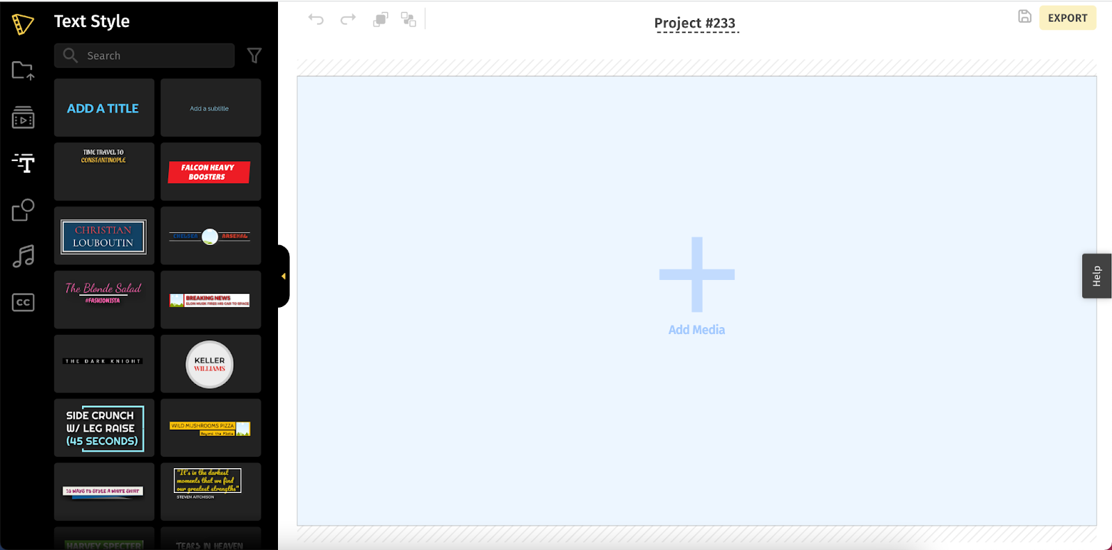
1. Create a new project
- Create your project and get started instantly. (You don’t have to sign up right away, you can do that later when you’re ready to export your video).
2. Upload your video
- Click the ‘+’ icon (on the canvas) to upload your video. You can either choose to upload from your system or simply drag and drop the video file.
Pro-Tip
Need some help to get started? Check out the Stock Media Library for high-quality images and videos that are freely available. Click the Stock Media option (second icon) from the left pane and browse through relevant, high-quality videos and images.
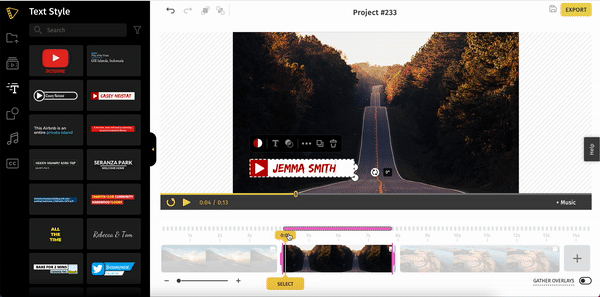
3. Add lower thirds to your video
- Select the specific duration on the timeline where you wish to show the lower third.
- Click Text Effects (third icon) from the left shelf to add a lower third to the video.
- Choose a template from predesigned styles. If you’re looking to amplify your brand, we recommend choosing a logo template.
- Most of these templates also come with animated effects to grab a viewer’s attention when they are played. Hover over any template to preview what this looks like.
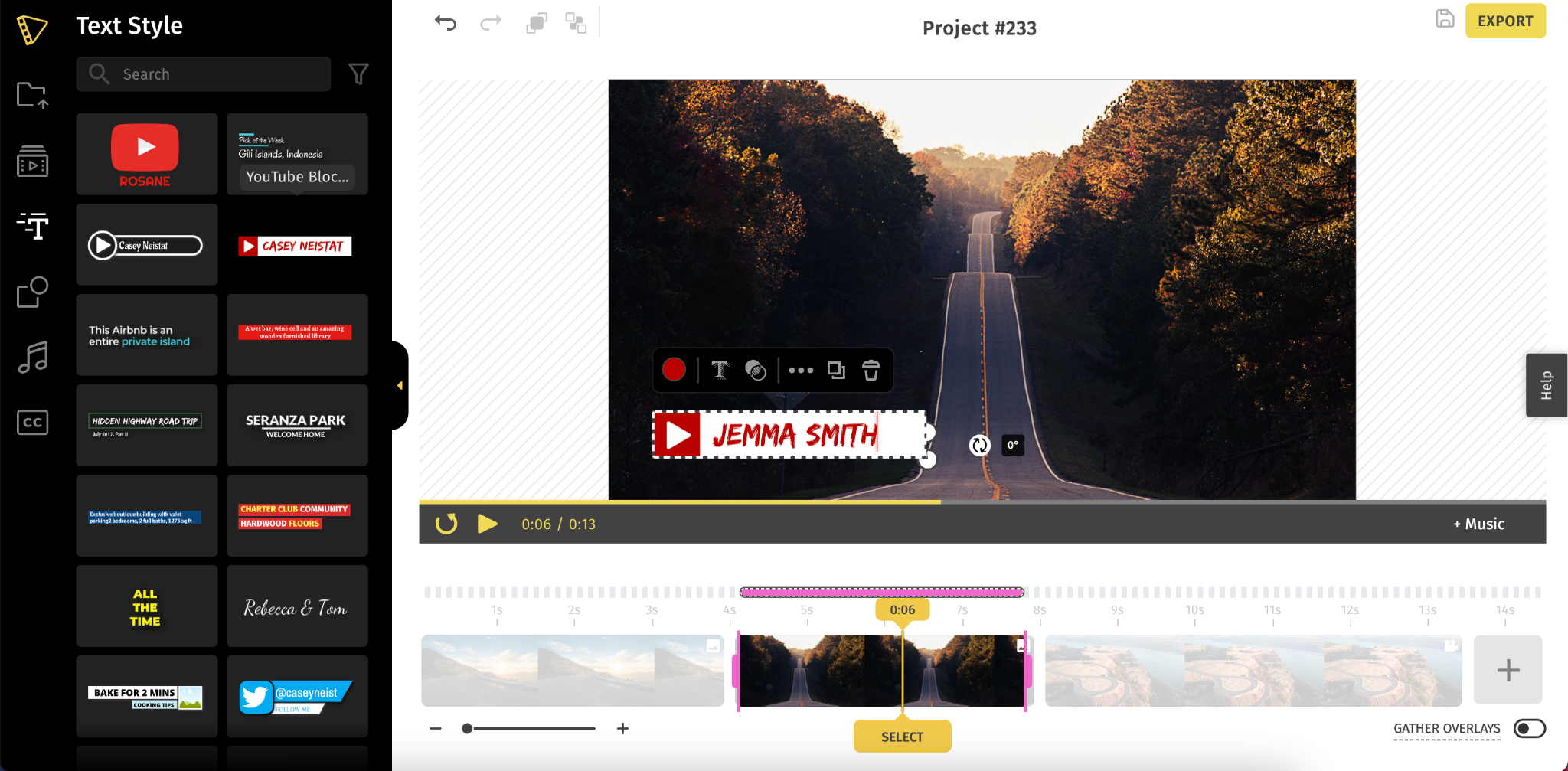
If you’ve added a logo template, click the image to replace it with a photo or your logo.
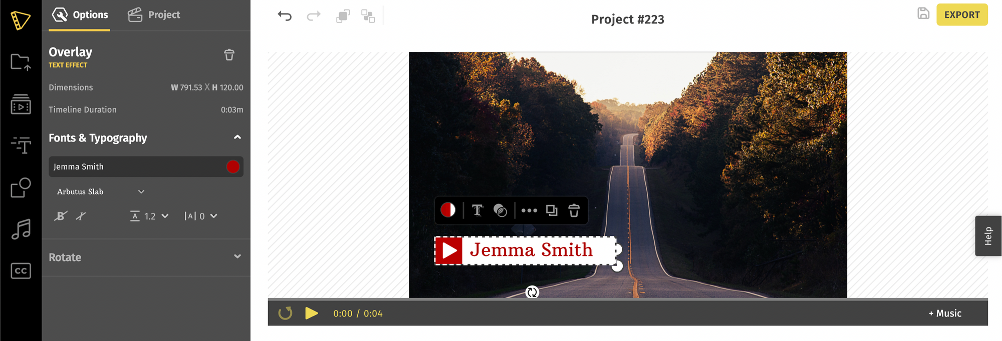
4. Customize your lower thirds
Next, customize your lower third to match your video style. Click on the More Option (appears when you click on the template) to format the font size, color, style, letter spacing, line height, and even advanced other options like rotating text overlays.
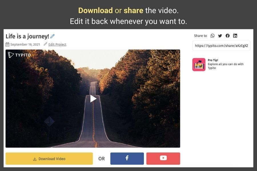
5. Export your video
- Once you’re done putting your video together, click on the export button from the top right corner.
- Depending on the video length, the rendering process begins and might take anywhere from a few seconds to minutes.
- Once complete, you can download the video to your system, publish it to your YouTube channel or share it with others.
Add Lower third text to video on Typito: video with lower third
5 Best Lower Third Templates to Use
You can create lower thirds in any way you want - whether you choose to use an online tool or create one from scratch. But why reinvent the wheel when you already have great pre-designed templates available to choose from?
Typito has an extensive gallery of lower third templates that you can use to design your video, and they are only a search away. Although we have 200+ templates to choose from, here are some of our best picks to go with.
1. Lower thirds with logo template

As the name suggests, the logo lower third template is perfect if you’re looking to highlight your brand logo. If you’re creating videos for a brand, chances are they have unique brand guidelines defined by a color palette, font, and logo. A template like this can make both the logo and text stand out.
You can customize the lower third template to change the color of the text to match your brand colors. As for adding your logo, just click the placeholder in the template and replace it with your own logo.
2. Breaking news lower third template

News channels have built a unique brand recognition through the video style they’ve adopted. Lower third text templates like these are specially designed to ensure video news that the templates highlight your headlines.
Break your news stories with clean and simple breaking news lower third template. Add your news channel logo to the image placeholder and edit the two text fields with the news story you convey. You can customize the templates to reflect your brand as well—swap font style, color, and size according to your brand preferences.
3. Stylized lower third template

Stylized lower third templates are great for travel and lifestyle videos. What’s the point of showing a stunning destination to your viewers without highlighting the name of the place?
One of the best ways to influence potential prospects to travel to a tourist spot is by immersing them in amazing travel videos with well-written descriptions. Now, that’s where this travel template comes in handy.
Choose more upbeat styles to match the tone of your video, and don’t hesitate to touch it up with contrasting colors to match your brand style.
4. Food lower third templates
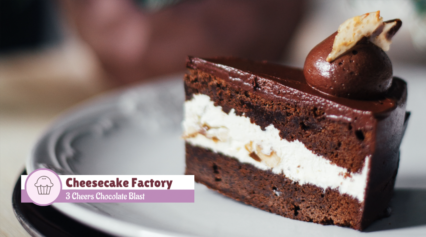
YouTube vlog videos are almost incomplete without those captivating lower thirds. This template features two text fields to add your recipe name and your channel name. The image placeholder lets you add your brand logo. Change the color and font size based on your preferences, and it's done. It’s as simple as that!
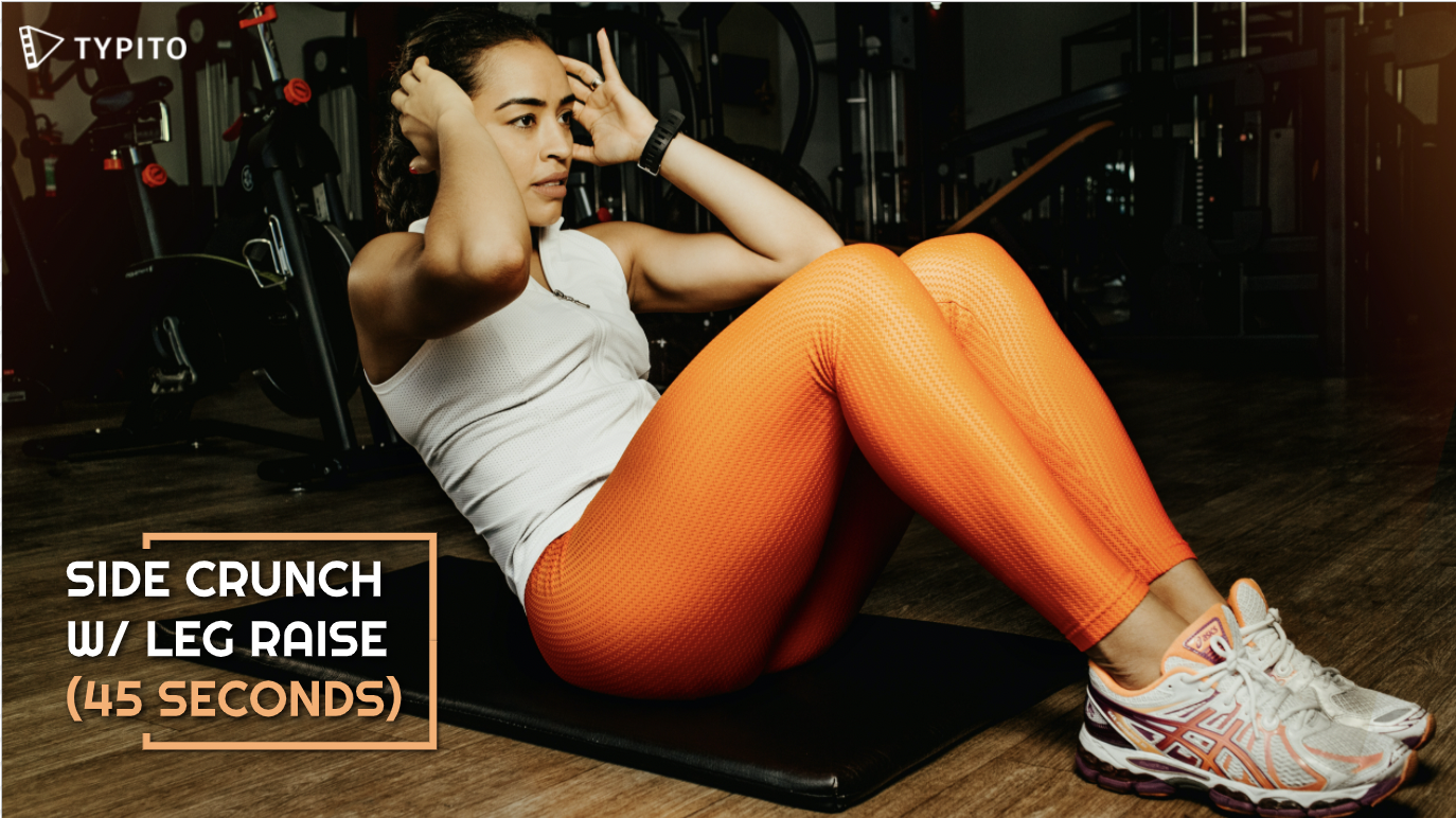
5. Countdown timer lower third template
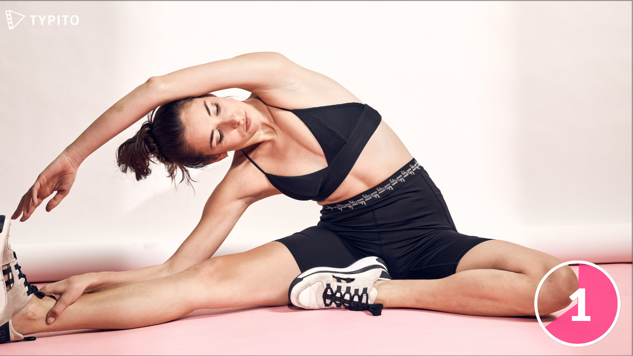
Whether you want to build suspense for a significant moment in your video to draw attention or would like to keep your audience engaged in an activity for a specific duration, a countdown timer, and lower third templates are extremely helpful.
You can add beautifully designed Timer effects to the video with drag-and-drop templates. It's easy to customize without the help of a video editing expert.
You can increase or decrease the time countdown, changing the background color and font color or style, in just a click.
So the next time you create videos for an exercise routine, fitness, wellness, yoga, dance, or any other instructional clips, make sure to add a timer template.
5 Best Lower Third Examples for Inspiration
There is no rule set in stone when creating or using lower thirds. Although they are usually composed of tiers or 1-3 lines, they don’t necessarily have to be just words and brand names.
Often, you will also come across lower thirds with a nice shadow effect to make it easier for the audience to read. It can also contain icons, animations, shading, boxes, backgrounds, and other attractive graphical elements to grab the viewers’ attention.
Here are some fantastic choices arranged in popular categories to be inspired and help you get started.
1. Minimalist lower third

This is an excellent example of a Minimalist Lower Third. These are great for text-focused lower thirds since it has two text fields for varying lengths - long and short to highlight a vital title text (in larger font size), followed by a subheading (in smaller font size).
Use bold font to keep the focus on your text and bright colors that contrast with the video so it’s visible.
2. Elegant lower third with a background
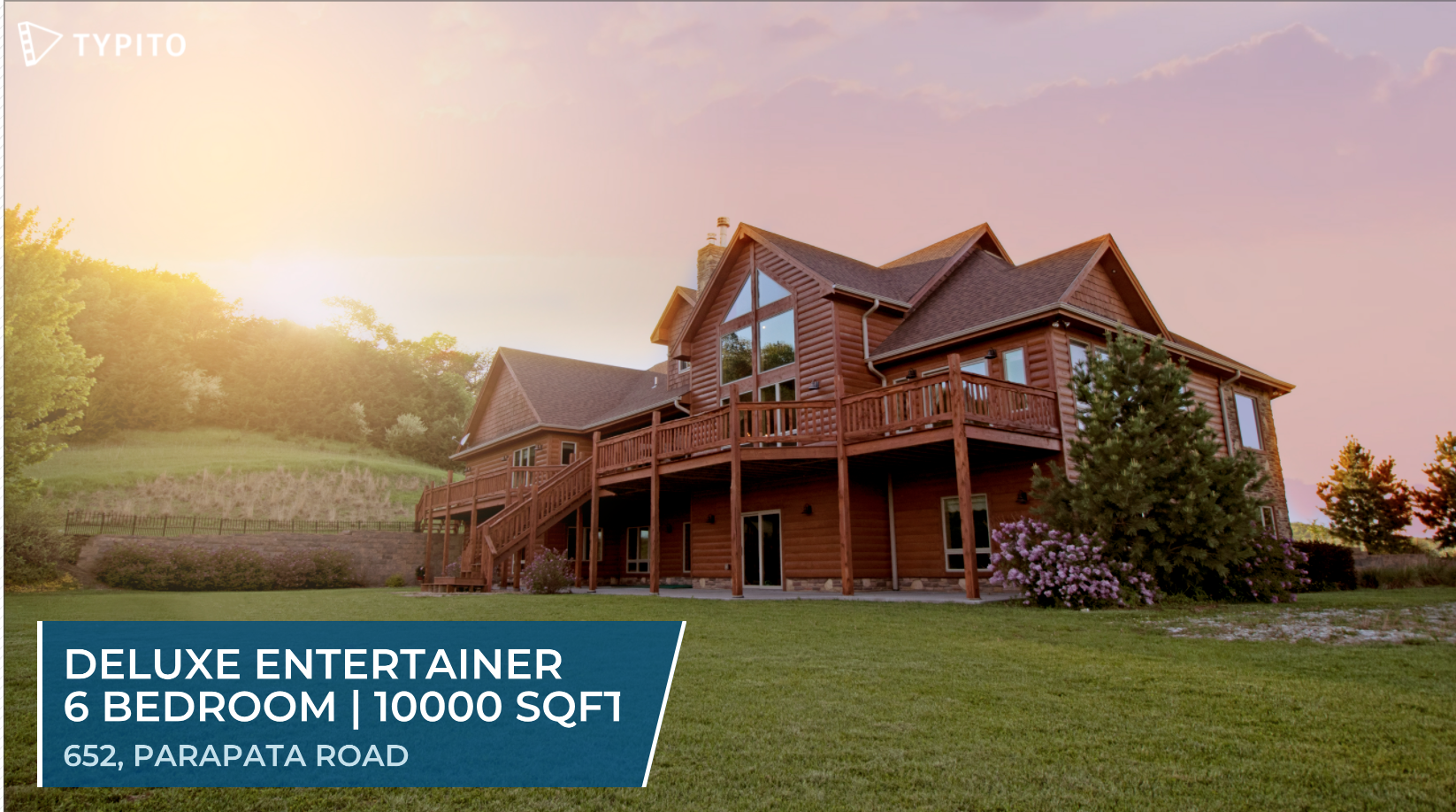
If you find the colors of your video conflicting with the text you want to add, consider using a lower third that has a background. Here’s an example of how a lower third with a background makes your text clear to read. You can edit the font size, color, style, and background accordingly to match the tone and style of your video.
3. Highlight lower third

A great way to ensure viewers don’t miss out on key information is to highlight keywords in your text captions. Highlighting keywords is also a smart way to make your text skimmable. Be sure to use bright colors and build a contrast that’s hard to miss. Combined with some cool text animation effects, this design goes well with any informational video.
4. Text with graphic lower third
With dual circle layers in solid colors and animated effects, this round, stylish, and funky lower third design is a great way to bring a pop of color and fun elements to your video. It's ideal for flaunting your channel or brand that delves into fashion, art, style, and more. It gives you the option to alter color tints and fonts to match your requirements.
5. Step-by-step lower third
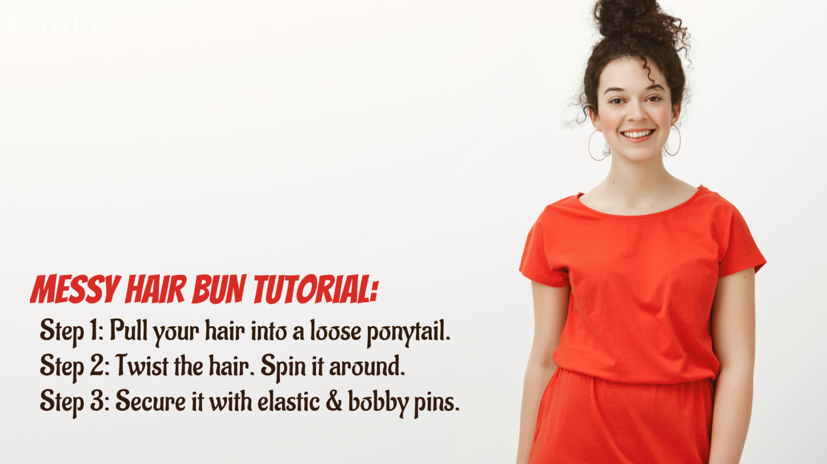
If you’re looking to add steps for a tutorial or create listicle videos, this lower third is apt. This template makes it easy to create steps or lists that are clear and you won’t have to worry about spacing or alignment. You can just drag and place the template on your video to position it where you want. As with any of our templates, you can change the font color, size, and other branding elements based on your preferences. Add contrasting colors (just like the one in the screenshot) to increase visibility.
5 Key Elements of Lower Thirds
In its simplest use, a lower third can be used to overlay text on the video. However, when used well, it adds flair to create video projects. But how do you use lower thirds well enough to add a layer of professionalism to your videos?
A well-designed lower third can have multiple components that blend in - typography, layout, logos, shapes, motion graphics, and animation.
When working with lower thirds text templates, you will have a ton of design options and the customization is extensive. You could use a template - swap out the color, font, and alignment, and have a unique stylized lower third for your next video. With these options, you can either make a lower third extremely simple or too complicated.
Here are 5 core elements of a lower third that you’ll want to pay close attention to, to ensure your lower thirds are aesthetically and brand-consciously designed :
1. Typography
When it comes to creating lower thirds, clarity in displaying information is extremely important. In fact, it's one of the perfect strategies to ensure that viewers remain glued to what’s happening in the frame.
Best practices:
- Use a clear bold font style
- Make sure that the font is readable and not distracting
- Avoid using lengthy sentences/phrases — keep it precise and short
- Ensure that your font style matches the brand’s tone for consistency
2. Color
Color is a crucial element when it comes to lower thirds. It’s something that blends all elements and makes it pleasing to a viewer’s eyes.
Too much of pastels and your text is lost, too bright and your text steals the limelight of your video. Since lower thirds take up only a small part of the screen, there’s a risk of overwhelming your viewers with colors.
Choose a color that compliments the background tones of your video. Doing this will allow you to grab attention without stealing the focus from your content.
Best practices:
- Stick the brand color scheme
- Avoid using too many colors at the same time
- Refrain from using colors that are jarring or distracting
- Aim to have only two colors instead of multiple shades
- To make the text stand out, use contrasting colors between typography and background
3. Logos and Shapes
Logos and shapes aren’t mandatory in lower thirds, but a logo creates brand awareness if you are working with an organization or company. Shapes, on the other hand, help accentuate both the brand logo and the text.
TV networks are a great example of how to use logos into the lower thirds to make them more visible so viewers know what channel they are watching.
Best practices:
- Follow the style guide of the brand
- Use shapes that can help both typography and logo to stand out
- Add shapes behind the text for better visibility
- Make sure that that shape’s background color isn’t distracting away from the logo
4. Size and Position
Just because they are called lower thirds, it doesn’t mean you have to place them in the lower third of the screen. They are named so because that’s the place they are most commonly found (and aesthetically pleasing too). Also, it has a bit to do with the Rule of Thirds.
Let’s understand this with an example. Assume that you’re filming someone’s interview and you want their eye level aligned with the upper third portion of the screen. Now, putting the name in the lower third helps add balance and symmetry to the frame.
But let’s say that the background visual of the graphic doesn’t make an ideal spot for the lower third. What do you do? In this scenario, if you think that the text will look more appropriate in some other screen area, feel free to move it.
It isn’t necessary that your graphic or text have to be in the lower third mandatorily. There’s no rule as such. Just keep ‘symmetry’ in mind. It only makes sense to place the name in the lower third if the subject’s eye line is in the upper third.
Best practices:
- Make sure to keep the lower third in the title-safe area
- Keep it compact, precise, and less distracting
- Arrange the text in one-, two-, three-, or four-line layout
- Ensure that the lower third is not so small that the text becomes illegible
5. Animation styles
Should you animate or not? Well, the answer to this question is a bit tricky. The safest way to play this is never to go overboard - whether you’re using a logo, text, shapes, or a combination of these elements that can be animated. These work best for intros, outros, or any type of transition. But then again, ask yourself if the design is distracting.
Best practices:
- Animate the typography by lines, words, or characters
- Don't animate lower thirds occurring in the mid-segment because it can be distracting
- Use animation styles that are not just discreet but also less likely to grab a viewer’s attention
Tips to Create Stunning Lower Thirds
While working with lower thirds, just using a random template might not cut it for your video. Why? Multiple factors play a key role in making lower thirds look extraordinary.
Whether you are using lower third templates to get the job done or creating from scratch, here are some important tips to keep in mind.
1. Keep it clear and simple
The golden rule - Lower thirds should be clear, visible, and easy to read.
Therefore, it's important to optimize font size, style, and color to add clarity. Usually, sans-serif fonts are tried and tested styles that are the easiest to read. Avoid picking a fancy font as it makes reading difficult.
Ensure the color scheme you use compliments the video’s overall look. Of course, this depends on the production but it would be wise to stick to the brand colors.
2. Placement of the title
Let’s say you have a scene where adding location and time to it is important for the frame. Undeniably, the lower third is the right approach to do this, but the question is how creatively?
Most videographers prefer creating a hierarchy so that it's easier for the viewers to read it. Speaking of this example, you can display the location in larger fonts whereas time is in a slightly smaller font. By doing this, you’re giving prominence to the most crucial part of the information without losing focus on the frame.
As said earlier, a lower third doesn’t have to be in the lower part of the screen necessarily. You can always balance it in a way to visually look nicer and cleaner.
3. Keep them precise and short
Too much information makes it hard for your viewers to read and makes it look off. Convey only what’s needed in the lower third. Pick the most important information and highlight it. Do not clutter the space with excess details. The information given in a lower third should be clear and skimmable in a glance.
Conclusion
When it comes to creating stunning lower thirds, the sky's the limit. With various elements, the possibilities are pretty vast. While you can utilize the ingredients in a way you want to, you don’t have to include everything to create one.
Remember, less is more! So, keep things simple. If you don’t want to spend too much time trying your patience with animation styles, choosing the ideal color scheme, or coming up with creative designs, lower third templates are the best way to go.
When blended rightly, lower thirds can be extremely helpful in creating brand awareness and emphasizing your main message. With Typito’s pre-designed animated templates, you can create stunning lower thirds without the help of a video editing expert.
Want to experience smooth and simple video editing? Head over to Typito and create engaging videos with lower third text templates.