Creating intros or adding text and titles to your video can be frustrating - You feel it has not come out quite right but then you are not exactly sure what can be improved. We will dissect the problem of creating intros and adding text on videos using a simple framework.
C.R.A.P is a simple and easy to remember (for obvious reasons) framework put forward by designer Robin Williams in her book The Non-Designer's Design Book. Check it out if you have a fledgeling interest in design and want to nurture it.
So let's get down to business.
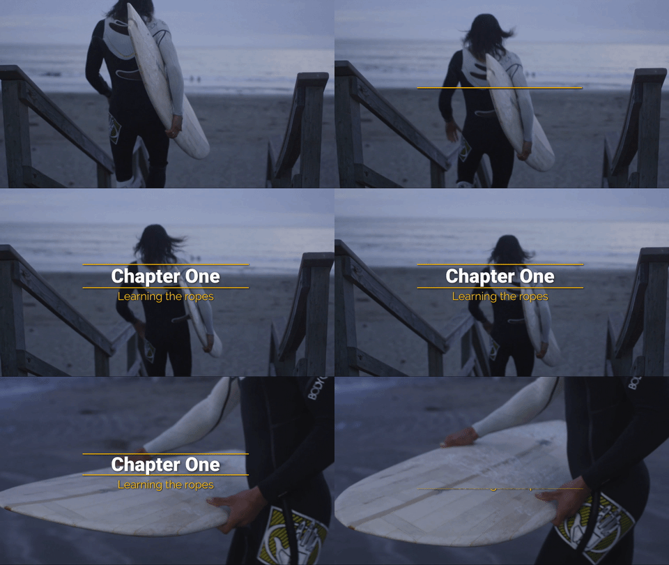
For the purpose of analysis, let's take this intro that I created on Typito, using the simplest of elements available to me - A rectangle, fade-in transition and a set of typefaces.

The bland, simple way to introduce your video
C.R.A.P
Contrast
Contrast should be used to highlight the most important points that the audience should take away.
In the above intro, there are only two pieces of information, and the most important among them is the title. We should draw the viewer's attention to the title, and that can be achieved by giving the title a higher font size so that the first thing the eye notice's is the title.

Creating a distinction between the title and the sub-title
Repetition
Repetition is the act of unifying all the parts of the design by achieving consistency
If you look at the design of the intro, there are three elements - The rectangular patterns, the title and the tagline supporting the title. The three elements are indistinguishable from each other and this makes the intro look bland.
Now, we can give a separate font to the title and the sub-title to make them stand out from each other. This style can then be adopted to any other titles or text that you have to add in the video. I have used Roboto Black for the title and Raleway for the sub-title.

Apart from giving separate font faces, I have removed the shadow from the sub-title, now the title stands out more prominently
The rectangular patterns can be unified by giving them a single colour. This also gives a contrast between the patterns and the text, making it more pleasing to the eye.
Alignment
Nothing should be placed arbitrarily, every element should have some relation with some other element on the page (video in our case)
Now the intro animation is in the centre of the video, hence it may be appropriate to centre align the title and the sub-title.
Also, you can observe that the video pans slowly from right to left, so it would probably look good if we can give a reveal in transition from the right. After playing with the speed of the transition a bit:

Just slide in smooth
Proximity
Items or groups of information that are not related to each other should not be in close proximity to the other elements, which gives the reader an instant visual clue to the organisation and content of the page (again, video in our case)
This does not necessarily apply to our intro since it has very few elements. But, one thing to note is that you should not try to fit in too many elements or text at the same time. For example, if you have another title that divides the video into different chapters, you should probably choose a different frame to put it in.

Don't have too much content in the same frame, spread them out
We had thought a lot about these principles when we made Typito, which is why they have been considered by default in the motion templates we made. You can use one of the templates we have created, or use the C.R.A.P principle to make a great intro for your YouTube video.

The motion templates available on Typito


