Few of them are so obvious you'd be surprised people still make them!
Almost everyone would agree that video is a more efficient medium than print/text or even images for that matter. I've tried to reason this out from a scientific and analytical perspective in this post; where I talk about how videos rule over text when it comes to communicating with your audience.
Text and videos can be married to create a powerful marketing medium (I'll let you read on to find out how). Before we dive into all of this, there are two things you will have to take care of when adding text on videos:
a. Aesthetics
Yes, the idea is not to outbalance the video with a lot of text. Adding too much text to a video can counter-intuitive. It affects the aesthetics and beauty of the video content instead of helping your audience retain the content better.
The text you add has to merge in well with the theme of the video and add to its aesthetic appeal.
b. Legibility
While it's essential to preserve the aesthetics of the video, the primary reason to have text on video is to improve the audience's ability to retain the content better. Keeping that in mind, it's critical to place the text in a way that is easily readable by choosing the appropriate text attributes like color, font, size, etc. The amount of words on the screen at one time is also a critical factor in one's ability to read. Not everyone can read paragraphs at a time as is with a Star Wars film introduction. There are some tools you can use to create readable chunks of video text such as split text online tools to easily break large amounts of text into bitesize amounts. Ultimately the amount of text the video needs is up to you. One of the best examples of text done right on videos is the title of "Thirsty For" videos made by Tastemade. The title blends well into the video adding to the already mesmerizing video shots; which is presented in a manner that you can read and comprehend without much difficulty.

Title on Tastemade's Cioccolata Calda video
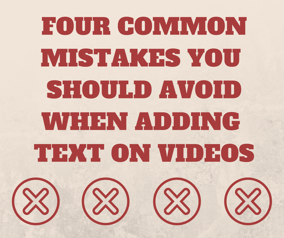
Now, achieving a good balance between aesthetics and legibility while adding text on videos is not very tough, but you should avoid apparent mistakes when doing this. I want to talk about the most common mistakes people make when adding text on videos.
Before getting to that list, let me show you a quick video clip with text that's got everything wrong about it. We will then discuss each aspect in detail and explore how to fix them:

How not to add text on videos
1. Color
The color of the text you add on a video should contrast well with the video content. It's important for the reader to be able to grasp it without a lot of strain. In this case, black text is probably is not as bad as a green or blue (these colors would've merged with the background!), but is still in the same color range. This hampers readability and doesn't help much with aesthetics. A bright color or white would do a great job here.
If you are very adamant about your choice to use black text, perhaps because it's one of the brand colors you follow for all your videos, there is a way to do that.
The idea is to place the text over a background object that contrasts well with the text color. It's also important to keep the background object slightly transparent (opacity - 0.7 to 0.8) so that the video content behind is not obstructed. Here's an example:

Text on a background banner/object enables you to maintain the required color contrast for better readability
2. Size
This is straight forward. You need to evaluate what importance the text carries. If it's a sub-title, you could place it at the bottom and maintain a small font size. In the case of a title, like in this video, the text size can be 3-4 times bigger. Unlike a sub-text, the audience shouldn't miss it under any circumstances.
Many people tend to keep text really small assuming it would affect the video output. If you think the message is important, it should be big and bold out there on the video.
3. Position
You would have noticed that the text added on the 'wrongful' video clip sits on the left bottom corner. Looks fine right? While your intention might have been to keep it to the corners so that the video content is not perturbed much, you might end up making a big blunder there. Never add text or other motion graphics in the top and bottom 10% of the video.
Most web-based video players including YouTuve, have video player controls (timeline playback, pause-play buttons, etc) that run along this section. This could disrupt viewers from reading any text that you've placed in this section of the video.
Positioning the text is very important. When it comes to critical text like titles, always position these at the center of your video frame and have no qualms about it. If it's an assisting annotation, position it to the left or right side towards the top in the bottom 2/3 of the video.
4. Duration
"Did I miss something?" Yes, You most likely missed out on that text animation because it was on-screen only for 2 seconds.
When animating your text, always make sure that you give your audience sufficient time to read and comprehend the text you add on the video. If you fail at this, the very purpose of adding text on video goes for a toss.
Please do not keep movie sub-titles as a good reference for text duration. In most cases, movie subtitles don't have an option to be on screen for a long time because of the high volume of dialogues.
A good practice to follow is to keep the text for 2 seconds more than the average reading time. There is an exception to this rule though, for example, when the text needs to appear in sync with certain scenes. In such cases, you can skip out on this rule.
I hope this has given you a fairly detailed idea of how to add text on videos the right way. Although we've discussed and listed out 4 ways to fix text on your video, this post would be incomplete if I hadn't corrected the clip we saw earlier.

Enable the audience to grasp and retain the message well.
As you can see, I've used white text since it stands out well like in most videos (Fact: It's tough to produce absolute white color in naturally captured videos). I've used a bold Chewy font, resized to large to stand out at the center of the video.
You'll also notice that I added my own touch to the title with the location icon I downloaded from Flaticon - one of the best repositories for icon graphics. The graphics stays on-screen for approximately 5 seconds so that the audience has time to grasp it well. This was created using Typito, online video editor that enables you to add text on videos in a few seconds.
I hop this blog post helped you understand the most basic guidelines to keep in mind while adding text on videos. Do share your experiences adding text on videos in the comment section below.
Looking forward to hearing your thoughts about adding text on videos.