Lower third titles, popularly called lower thirds, is a graphic overlay placed in the title-safe lower area of the screen, though not necessarily the entire lower third of it, as the name suggests. In its most popular avatar, text overlaying the video, lower thirds help the audience build better context with the video content.
In some cases, it's used to denote the name and credentials of the speaker on screen, and in another context, it's used to provide users extra information in the context of the video that enhances the video watching experience for the audience. In every use-case, lower thirds use the power of text on videos to build better content retention and association for users.

5 Tips For Adding Lower Third On Videos
Here are a few tips that could help with creating beautiful lower thirds on your video:
1. Font Type
It's important to choose a font that is readable and goes well with the theme of the video. On the readability front, a golden rule you could follow is to have san serif fonts. Serif fonts could make it difficult for viewers to get it fast. When it comes to the theme of the video, you could check out what fonts go well with your video type. Here's a great resource to find what fonts go well with different video themes.
2. Don't have a lot of text
Try to relay your message with a crisp and short copy. The more text you end up adding on your lower third, the higher the chance that your viewers tend to ignore it. And remember, the text is only supposed to act as supporting lead to video. The moment text overrides video, the whole purpose of having text on video is defeated.

Do not add a lot of text in a lower third.
3. Define the right structure
Lower thirds, by definition, can be anything that you add on the lower third section on the video to augment the video content using text and graphics. In most cases, a lower third can fall under one of these categories: a. One-tier lower thirds: Usually used to identify a story that is being shown, or to show a presenter's name. b. Two-tier lower thirds: Used most often to identify a person on screen. Often, the person's name will appear on the first line, with his or her place of residence or description below it. Two-tier lower thirds may also be used as "locators" to identify where a story is taking place. c. Three-tier lower thirds: These lower thirds add more information.
Based on the type of lower third structure, you should define a structure for your lower third. Before getting on the video editor tool, I'd strongly suggest that you try to create a mock-up for your lower third on a paper or any mockup tool like Balsamiq or a moodboard maker like Milanote.
4. Brand elements and color
Lower thirds are a great place to align your audience with your brand and story. The lower third can be created using your brand colors, logo, and other design elements that represent your brand.

English Premier League video featuring Cristiano Ronaldo interview with a brand-compliant lower third
5. Add lower thirds on title safe area
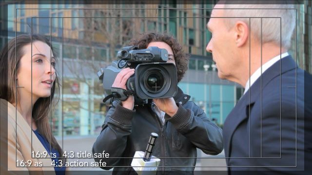
With a lot of devices/screens of various dimensions and video players coming up, it's important to ensure that your lower thirds can be seen without trouble on any setup. A good way to do that is to follow the title safe area when you create your lower thirds. Irrespective of the entry or exit animation of the lower third, ensure that the text and other important aspects of a lower third falls in the title safe area.

Content in a lower third has to be in the title safe area of the video (src: provideocoalition.com)
There are many tools that let you add lower thirds on your videos ranging from Typito to Adobe After Effects. Here's a quick video that shows how to make lower thirds fast and easy using Typito:
Hope you got a good idea about using lower thirds effectively on your videos. Do share your thoughts on lower thirds and how you have implemented them on your videos.


