Jump To:
- Why Trivia Video Design Decides Whether People Stay or Scroll
- Quick Reference: Trivia Video Design Decisions at a Glance
- Trivia Video Design, Layer by Layer
- Design Patterns for Different Trivia Video Formats
- FAQs About Trivia Video Design
- Conclusion: Build a Design System, Not Just a Video
Most trivia videos don't fail because of content. They fail because of design. Most creators don't have a problem making trivia videos.
Between AI question generators and stock footage, pumping out content is easier than ever. The real problem is retention.
If you look at your analytics, you'll likely notice that most trivia videos lose viewers right before the answer appears. Why? Because the design doesn't create tension or a clear visual hierarchy. Viewers get bored waiting, or they simply can't read the question fast enough.
Shift your mindset: color, animation, and layout are not decorations. They are the exact mechanisms that keep someone watching through the reveal.
Below, we've broken down each design layer and how to use it to hold attention at every stage of the video.
Tactical Takeaway: If someone can scroll past your trivia video in 0.5 seconds without registering that a question was asked, the design isn't working.
Why Trivia Video Design Decides Whether People Stay or Scroll
When trivia videos feel flat, it's usually because the creator treated design as decoration rather than a functional tool.
Every trivia video has three core design layers, and each controls a specific viewer behavior:
- Color creates a sense of urgency.
- Layout directs viewer attention.
- Animation signals timing and pacing.
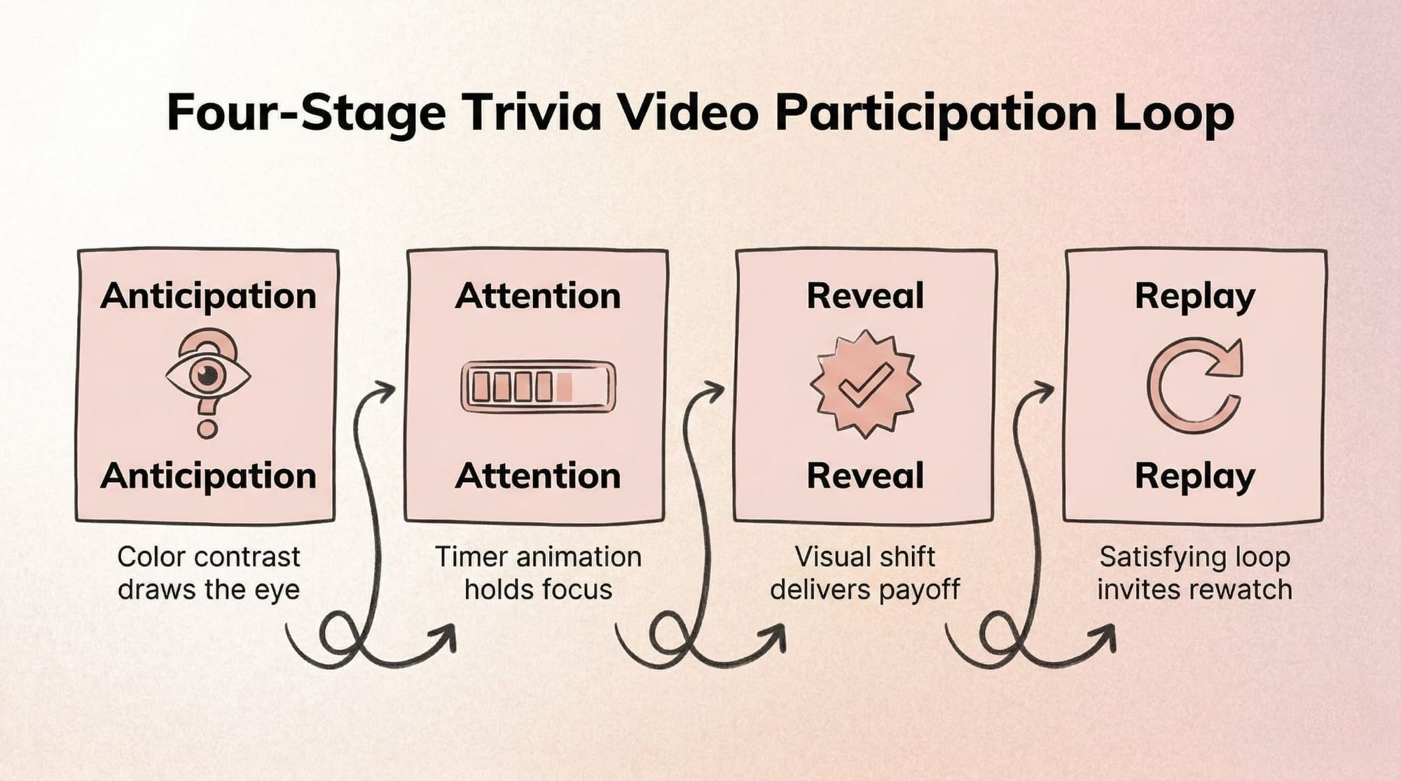
When these layers work together, they create a participation loop. Every trivia video follows this loop: Anticipation > Attention > Reveal > Replay. The visual setup builds anticipation, the countdown holds attention, and a distinct visual change at the end delivers the reveal. This sudden contrast is exactly what triggers a replay.
Quick Design Audit (Takes 30 Seconds)
Before opening your editor, run your most recent video through this short diagnostic checklist:
- Does the question text appear on screen within 2 seconds?
- Is there a visual signal that time is passing (timer, animation, color shift)?
- Is the answer reveal moment visually distinct from the question moment?
- Would someone recognize this as your trivia series without seeing your name?
Tactical Takeaway: Pick one existing trivia video that underperformed and audit it against these four questions. It takes less than 5 minutes to find the design gap.
Quick Reference: Trivia Video Design Decisions at a Glance
Use this table as your pre-edit checklist. Each row maps a design layer to the mistake it prevents and the fix you can apply immediately.
Trivia Video Design, Layer by Layer
The three layers don't work in isolation. Here's what each one does and how to adjust it before you open your editor.
Color: How to Use It to Create Urgency, Not Just Aesthetics
Your color choices dictate what the viewer looks at first and how fast they feel they need to read.
- Contrast ratio controls readability. Use stark contrasts. A dark background paired with bright, bold text ensures the question is legible instantly, even on low screen brightness.
- Background tone sets the viewer mood. Dark blues and purples feel like a late-night game show, while bright yellows and oranges feel like fast-paced pop culture quizzes.
- Accent colors signal urgency. Only use your brightest color (like neon green or red) for the countdown timer and the final answer reveals.
- Color consistency makes your series recognizable. Post trivia regularly on the same channel? Lock in one palette and never change it. Viewers should recognize your format before they read the first word.
- What to avoid: Gradients behind text. They ruin contrast and make the words blend into the background.
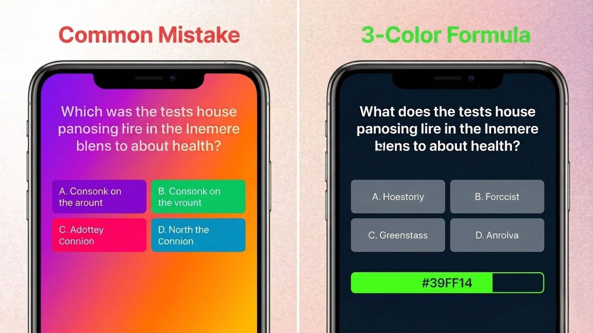
Tactical Takeaway: Stick to a 3-color formula. Use one dark color for the background, one light color for the question text, and one bright accent color exclusively for the timer and answer reveal.
Layout: Where You Put Things Controls What Viewers See First
Viewers read trivia videos before they watch them. If your layout is cluttered, they will keep scrolling.
- Anchor the question early. Keep the main question text in the top third of the screen. Left-aligning the text makes it easier to read quickly.
- Reserve the bottom third for the answer zone. This creates a physical distance between the question and the answer, forcing the viewer's eye to travel down when the reveal happens.
- Respect safe zones. If you are posting to Reels or TikTok, keep text away from the right edge (icons) and the bottom edge (captions).
- Structure multiple-choice clearly. Stack options vertically rather than horizontally. It takes less cognitive effort for a viewer to read a list top-to-bottom.
- What to avoid: Floating text with no background shape. Always put your text inside a solid box to separate it from the video background.
Tactical Takeaway: Sketch your layout on a piece of paper in 2 minutes before opening your editor. Draw boxes for the question, the options, and the timer.
Animation: How to Use Motion to Signal Timing, Not Just Add Energy
Motion should serve a purpose. If text is bouncing just to look energetic, it is distracting the viewer from reading the question.
- Choose the right countdown. Linear timer bars are great for showing exact time remaining. Pulsing circles work better for building anxiety and excitement.
- Keep question entrances clean. Use a simple fade or cut for the question text. Avoid slow slide-in animations that delay reading.
- Save the big transitions for the reveal. The transition from the question state to the answer state should be the most dramatic animation in the video.
- What to avoid: Never animate the question text while the viewer is trying to read it. Keep it completely static once it appears.
Some creators skip the animation setup entirely by using tools like Trivia by Typito, which builds countdown timers and reveal animations directly into the trivia video format so the design decisions are already made. It saves hours of keyframing and keeps the format perfectly consistent across a whole series.
If you need help pacing your videos, check out our countdown timer trivia guides.
Tactical Takeaway: If you're making more than two trivia videos a week, hand-animating timers will become your biggest time sink. Use templates.
The Reveal Moment: The Most Underdesigned Part of Every Trivia Video
The answer reveal is the emotional payoff. Yet many creators rush it, flashing the answer for a split second before the video loops.
- Build visual contrast. The reveal should look completely different from the question phase. Invert the colors, zoom in on the background image, or blur everything except the correct answer.
- Sync visual and sound. Even if viewers are on mute, a sudden visual pop (like a bright flash or a checkmark stamp) mimics the satisfying feeling of a correct answer chime.
- Give it breathing room. Leave the answer on screen for at least 2 to 3 seconds so the viewer can process it before the loop starts again.
Tactical Takeaway: Design the reveal moment to trigger a replay. Make the visual payoff so satisfying, and the transition so sharp, that viewers want to experience the loop again.
Design Patterns for Different Trivia Video Formats
Not all trivia is created equal. Your design choices need to match the specific format you're building.
- By platform: Vertical video (Reels/TikTok) requires stacked, top-to-bottom layouts. Horizontal video (YouTube/LMS) allows for side-by-side layouts, like placing a question next to a related image.
- By quiz type: Multiple-choice needs clean list formatting. Open-ended questions need a massive, unmissable countdown timer to fill the empty space. If you're doing image-based trivia formats, the picture must be the hero, with text acting as a small subtitle.
- By series vs. one-off: If it's a recurring series, build a rigid design system. If it's a one-off experiment, you can play with wilder colors and layouts.
- By production level: If you're recording on a phone, use native app text boxes for a native feel. If you're using a full video editor, rely on pre-built quiz video templates to maintain polish without the manual labor.
Tactical Takeaway: Before editing, ask yourself: What platform is this for? What type of quiz is this? Is it a series? Let those three answers dictate your layout.
FAQs About Trivia Video Design
Q1: What colors work best for trivia videos?
Answer: High-contrast pairings work best. Use deep, dark backgrounds (like navy or black) with stark white or yellow text. Reserve bright, neon accent colors specifically for your countdown timers and correct answer highlights to draw the eye instantly.
Q2: How long should animations be in a trivia video?
Answer: Keep entrance animations under 0.5 seconds so viewers can start reading immediately. The countdown animation should last exactly 3 to 5 seconds to build tension. The final answer reveal should stay static on screen for at least 2 seconds.
Q3: How do I make my trivia video look consistent across a series?
Answer: Create a master template. Pick one font, two primary colors, and one layout structure. Save this project file and simply swap out the text and background footage for each new episode. Viewers will instantly recognize your format in their feed.
Q4: What's the most common trivia video design mistake?
Answer: Treating the entire video as one flat scene. Many creators fail to visually separate the question phase from the answer phase. Without a noticeable shift in color, layout, or animation at the reveal, the video lacks an emotional payoff.
Q5: Do I need design software to make a good trivia video?
Answer: No. You don't need complex motion graphics tools. You can use format-native editors or dedicated video tools that offer pre-built quiz mechanics. The key is applying functional design principles like contrast and readability, regardless of the tool you use.
Conclusion: Build a Design System, Not Just a Video
The trivia videos that get replayed aren't always the most polished ones. They're the ones with the clearest question, the sharpest reveal, and a format the viewer already knows how to participate in.
When you stop treating every video like a blank canvas and start using fixed design choices, viewers stay longer and come back for the next one. A readable question and a clear countdown will hold attention longer than elaborate motion graphics that slow down the read.
If you're posting trivia more than once a week, the design setup is where most of your production time goes. Locking in a fixed template early (set colors, set layout, set animation timing) cuts that down to minutes per video.
If you'd rather skip the template-building step, Trivia by Typito has the layout, timers, and reveal animations already structured. You write the topic; it handles the format. Worth trying once to see how much of the design work is already done for you.
For more on trivia formats and what works on each platform, see our trivia video formats overview.