As a YouTuber, you put enormous effort into planning, shooting, and editing your videos. Still, two factors often get overlooked—one, the YouTube thumbnail size ratio, and two, a creative thumbnail design that can increase your video clicks and views.
Your video thumbnail is more important than you think. It's practically your video's first impression. Believe it or not, more than the representation of the video content, an eye-grabbing thumbnail is a great way to entice your viewers. A creatively designed YouTube thumbnail can incite curiosity and urge people to click and watch your video.
Not convinced? Here are some facts worth considering:
- According to Wistia, videos with thumbnails land 21% extra clicks than those without one. So right off the bat, we know that thumbnails make videos click-worthy.
- According to YouTube, about 90% of the top-performing videos have a custom thumbnail.
- A study conducted at the Columbia Business School reported that video thumbnails extraordinarily influence advertising attention and the overall experience.
- According to Forbes, thumbnails have an immense influence over the viewers' attentive and dynamic responses. Hence, advertisers should try placing the essential elements of the advertising messaging first—such as products, logos, or CTAs (Call to Action). This helps encode the distinctive assets into the consumers' minds, enticing them with resonant messaging.
From the moment you’re scrolling past videos on YouTube, you mentally evaluate the video content from what you see in the thumbnail, even before lifting a finger.
We know many users straightway want the formula to make the best thumbnail for YouTube, but we believe it's better to teach a man to fish than give him the fish.
When you’ve finished learning all about the YouTube thumbnail size guide, it’ll be easier to replicate results that some of the best content makers follow to get more click-throughs.
So, let’s get started.
Quick Links:
- What is a thumbnail?
- YouTube thumbnail size and resolution
- How to choose a custom thumbnail image on YouTube?
- YouTube thumbnail best practices
- Importance of YouTube thumbnails
What is a Thumbnail?
A thumbnail is a clickable and compressed image preview that represents the original content of a video. The size of the thumbnail varies based on the platform you use.
Speaking of YouTube videos, titles and thumbnails act like billboards that help the viewers to decide whether to watch the videos or not. A well-designed thumbnail can attract people to your YouTube channel and, further, make your video content more appealing for a wide range of advertisers.
We experimented with the idea of showing face on the thumbnail versus using stock photos from Unsplash or Getty Images. It turns out that putting stock photos didn’t contribute to as many views but having a face on the thumbnail brought staggering results. The clicks simply shot through the roof in no time.
So if anything, this tells us that people prefer watching videos that have a human element. It feels less commercialized than thumbnails with stock photos. But obviously, all of these are variables that vary depending on the niche you’re targeting.
Suppose you have a personal brand where you often engage directly with content consumers. In that case, it coheres with YouTube standards to have an appropriately sized, high-quality thumbnail with your face in it.
Let’s get into the specifics of the YouTube thumbnail dimensions and how you can optimize yours to garner more clicks.
YouTube Thumbnail Size and Resolution
The thumbnail size that YouTube recommends is 1280 x 720 pixels.
Besides that, your YouTube thumbnail should follow these guidelines:
- Minimum width of 640 pixels
- Maximum file size of 2MB
- Size ratio of 16:9
- The thumbnail image size should be within 2 MB
- Use 16:9 aspect ratio because that’s the most commonly used on YouTube
- The accepted file types for uploading your YouTube thumbnail image are PNG, JPG, or GIF. (Source: Google)
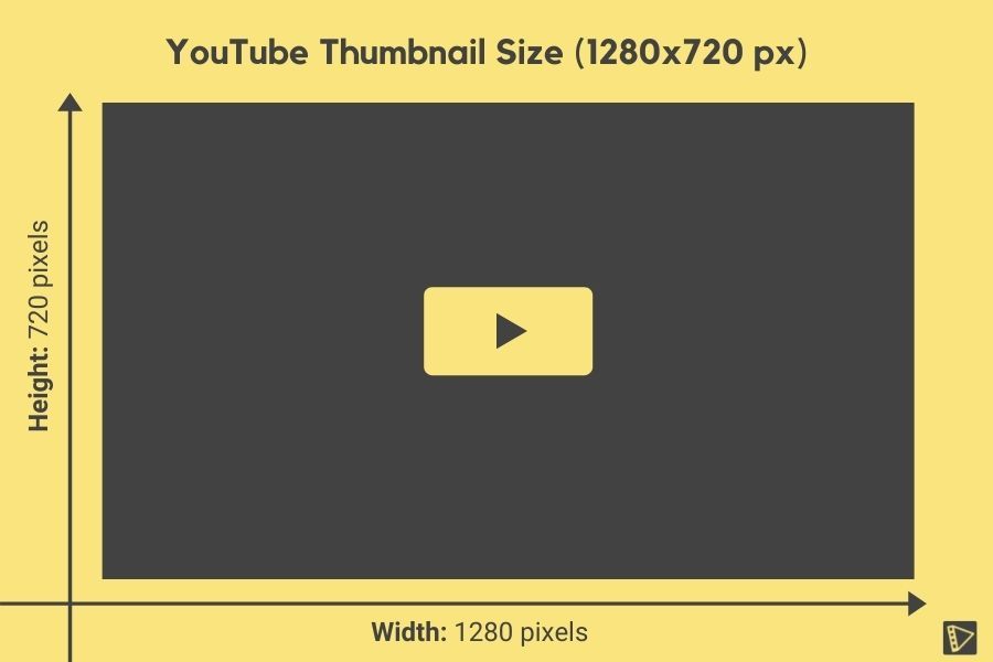
Ideal YouTube Thumbnail Size
For ideal results and to boost video SEO, it’s always good to follow the best practices that YouTube recommends. Aim to keep your YouTube thumbnail size ratio at 1280 pixels (in width) and 720 pixels (in height).
Any YouTube thumbnail resolution lower than this could make the image blurry and pixelated in specific device screens. The ‘1280 by 720-pixel resolution’ isn’t something that YouTube has randomly picked up. It is the dimensions of the 720p video (or the HD video) and is the playback resolution by default.
Minimum YouTube Video Thumbnail Size
Although the YouTube video thumbnail size needs to be 1280 x 720 pixels, this isn’t cast in stone. You will have some leeway to customize the size if you can’t get your thumbnail to match the exact pixel dimensions.
Enlarging your thumbnail makes it readable on small or large screens, especially when you have added text to give viewers an idea about what they can expect.
If you want optimized thumbnails for multiple devices, you could use any suitable image editor to customize your thumbnail, download it, and shrink it to 10%. This way, you can preview the font to know if it’s readable when you are several feet away.
The larger size translates to more flexibility in calibrating thumbnails to screen resolution. Anything small and blurry will have its flaw accentuated on Retina displays or anything capable of crisp output.
If you’re worried about the sharpness of your thumbnail, then resize it. This allows the preview to auto-adjust itself to the dimensions of the embedded player or the playlist queue.
Pro Tip:
Another thing you should be mindful of is the YouTube thumbnail size ratio. The de facto standard is 16:9. If you’ve filmed your video vertically, you could also settle for a taller 4:3 aspect ratio.
The only downside in choosing a taller aspect ratio is the presence of two black bars on either side of your thumbnail image. The excess frame is padded to compensate for the standard dimension. If you go with a panoramic image as a thumbnail, the space above and below will be padded.
Most recording devices like cameras and phones shoot videos in a standard 16:9 aspect ratio for seamless online use. This is why the golden rule for thumbnail size optimization needn’t be something you should always factor in.
If you’re going to use a frame from your video as a thumbnail, it’s more likely to have an aspect ratio of 16:9.
How to Choose a Custom Thumbnail Image on YouTube
As you already know, custom thumbnails are essential to get people to watch your video and have success on YouTube but making thumbnails like pros can be pretty challenging if you are new to it.
It is entirely possible, even if you lack skills with advanced video editing tools. Now, let’s jump into some quick and easy tips to make your custom YouTube thumbnail pop.
Note:
- By default, YouTube lets you choose the thumbnail from a selection of auto-generated still frames from your video.
- The option to choose and Upload Thumbnail will not be enabled as a part of the account set up. To enable the option to upload customized thumbnails, your account has to be verified first.
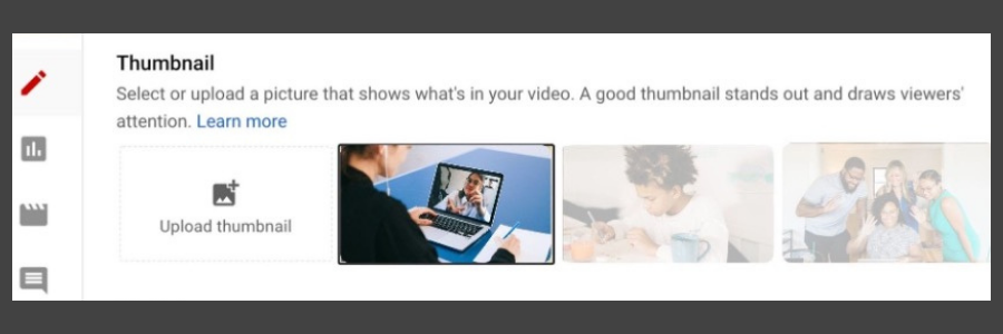
Here’s a step-by-step guide to verify your YouTube account to enable the “Upload Thumbnail” option:
- Login to your YouTube account.
- Go to the verification page and follow the steps given there.
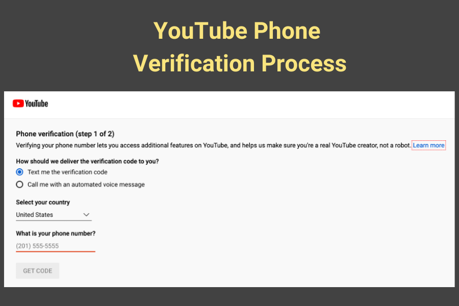
- Choose the mode that you want to receive the verification code in. It can either be a text message or a phone call.
- Select the country you live in and your phone number.
- Once you enter all the details, the Get Code button is enabled. Click on it.
- Enter the verification code that you receive and complete the verification process.
- You will then receive a success message from YouTube.
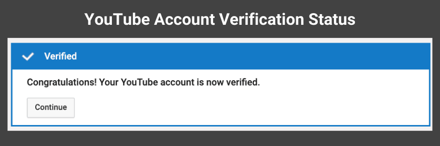
- Finally, you will see a screen that shows you a set of badges and your YouTube account status enabled with the eligible features.
- Since your account is verified now, the option to upload custom thumbnails should be enabled now for all the videos. You can always check this by navigating to Settings > Channel > Feature eligibility.
For a custom thumbnail, work on a separate image taken before or after the video. This image can be staged or edited using a good image editor.
How to create a custom YouTube thumbnail image?
Firstly, get a screenshot of the frame and save the image on your computer. Then head over to a good image editor (it could be Adobe Photoshop, Canva, or whatever tool you prefer). Create a placeholder of the size 1280 x 720 pixels and start editing it. Add text to show the audience what your video is all about.
Two things to follow while designing a YouTube video thumbnail:
- Be direct and original to give viewers a clear understanding of your content from the first glance.
- The other is the clickbait tactic. Let’s agree, no matter how much we loathe the clickbait thumbnail, most of us end up clicking it at least once because it’s too difficult to resist.
The rule of thumb to increase traction is to title your thumbnail with less than four words. Anything more can impact the impression.
If you have shot an image with your front-facing camera, it can be enlarged on any image editor to make it more straightforward for viewers.
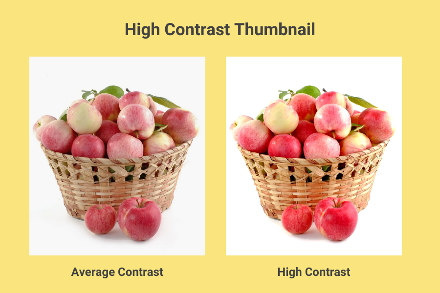
Clever content makers use DSLR instead of mobile phones to compete with superior quality images. You can also enhance the raw image files by adjusting the contrast, saturation, and sharpness.
Pro tip: A good thumbnail has 30% more sharpness and saturation.
A few things to keep in mind:
- Adding text to the thumbnail isn’t new, but you must know the rules to wield it correctly. Firstly, avoid fonts that make viewers squint their eyes. ‘Bebas Neue,’ ‘Oswald,’ ‘Poppins,’ and ‘Montserrat’ are excellent substitutes for artistic fonts like ‘Lobster,’ ‘Pacifico,’ ‘Yellowtail,’ etc.
- Plan your thumbnail around people who would care to pay close attention to it before judging your content. Viewers hate it when they are at crossroads, unable to determine whether your thumbnail is hiding something.
- Keep the text on your thumbnail readable but don’t exaggerate the details.
- Don’t leave anything to the viewers’ imagination.
- Clicking your video should bring about a visceral experience which is only possible when you push enough information to pique the viewers’ interest.
- Using shapes in the background to pop foreground text is another tested method in YouTube marketing. It works 9/10 times for content makers who want to be distinguishable.
YouTube Thumbnail Best Practices
When it comes to YouTube thumbnails, there are general best practices and creative ones you’re about to find out. We’ll be covering some of the best YouTube thumbnail practices you can follow right now:
1. Clutter and keepers
If you are looking at a thumbnail and can’t figure out what’s in it, that needs fixing. If you think of thumbnail ideas for YouTube, don’t just point your camera at anything unspecific.
Remember, value sells. So if it isn’t relevant, don’t bother using it. If you’re making a video on rainbow cakes, then your thumbnail should have a cake in the foreground while all others are muted in the background.
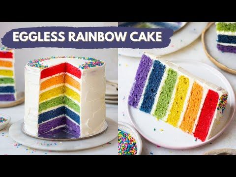
An example of a YouTube video thumbnail with clear text and a preview of the video content
This way, you’ll avoid the audience from confusing your culinary with a toy. So staging with things muddled and strewn around might imply the wrong message.
The best thumbnail is one that conveys to viewers what they’ll find in your video without looking like an aggressive sell. A good example is this YouTube channel, which focuses on baking and always features text and a preview of what the video content is all about.
2. Center of thumbnail
The center of your thumbnail is where most eyeballs land, so that’s where you should pay attention. Plan your thumbnail composition, so people are drawn to what’s in the middle rather than around it.
Shifting your gaze from one thumbnail to another can seem like a lot of effort to viewers, so if they have something in the dead center, that’s where they’re likely to click.

An example of a YouTube video thumbnail reflecting the brand color ‘orange.’
You’ll see classic examples like the one from Neil Patel, a famous digital marketer with thousands of subscribers. A majority of thumbnails on this channel feature a template that reflects his brand and gets people to click the video in a snap. Such thumbnails also build great eye-catching contrast. That brings us to the next concept.
3. The Contrast
Creating a ‘versus’ effect in thumbnails is common across YouTube. Unlike the center-weighted approach we just discussed, the versus template is good at comparing two things.
It helps viewers understand the content is a side-by-side comparison without even clicking the video. These are the types of thumbnails that are ideal for marketing products or comparing values.

An example of a YouTube video thumbnail with the concept of “Before and After.”
An example of a YouTube video thumbnail with the concept of “Before and After.” This immediately creates an information gap making viewers curious about what happened from before to after.
4. Near versus far
Many YouTubers blend styles to create a thumbnail of a close-up photo that relates to the action further behind. This type of thumbnail ropes people in because there is a face they’re familiar with and an activity they are curious about.
If you look up Mr.Beast on YouTube, you’ll find several examples of how he does this. Most of his thumbnails have him in the foreground reacting to the action within the video.

An example of a Mr. Beast YouTube video thumbnail featuring the ‘Near & Far’ concept
This is an advanced thumbnail style that you may want to experiment with. People appreciate and are often receptive to various styles, and you’ll never know what works best for your channel unless you experiment with different styles.
5. Thumbnail style
It takes some effort to develop your signature thumbnail style so your audience can recognize your videos from a glance. This doesn’t imply using the same thumbnail over and again, but rather tinkering with elements used in your thumbnail.
It makes viewers click on one of your videos and want to browse through the rest. The easiest way for them to keep doing this is to have a thumbnail they can readily recall as yours.
Jaiden animation is a popular YouTuber who made it big with her unique style of thumbnail and video. Her thumbnails show the main character on the right-hand side while the background has variables, including a rainbow with a color palette that somewhat resembles antiquated comic art.

An example of a YouTube video thumbnail featuring the main character on the right
In the same way, you’ll find several more examples of customized thumbnails that follow a set template or pattern telling people where it’s coming from without saying it.
6. Know thy competition
YouTube has thousands, if not millions, of videos uploaded on various topics. Most users just mimic pre-existing topics, but creative ones add a touch of their own.
While creating thumbnails, you could take inspiration from other content makers and customize with flair. If that sounds contradictory, take a look at the number of Fortnite videos on YouTube, and you’ll observe viewers being accustomed to clicking a specific style of thumbnails.
There’s a lot to explore when customizing thumbnails, like unique styles, personalities, and themes that probably haven't factored in. To remaster thumbnails while following someone else’s footsteps, learn from people who have succeeded in developing their style and their audience’s reception.
While you may think the overarching topic may be similar, the audience to which each content maker is speaking may not be the same. The YouTube community is all about diversity, where you’ll find teens and tweens in one group and adults in another, but both factions having a common interest.
When sizing up to the competition, take note of whether your competitor is making videos in the same category, and if so, learn how thumbnails are different for each audience type. Children are more likely receptive to visual handrails than older adults who seem to be drawn by subtler themes.
7. Optimize the video thumbnail for different screen sizes
Another way to lean into best practice is to optimize the thumbnail for multiple screen sizes and particularly for the ‘suggested’ category because that’s where you’ll find a majority of new viewers.
While thumbnails for videos you’re browsing can be large, the ‘suggested’ content is often displayed on a smaller dimension. This would make poor-quality thumbnails unreadable.
So go big on your thumbnail dimensions and optimize the clarity for the ‘suggested’ category on mobile. About 55% to 70% of thumbnail impressions are registered from mobile devices. If anything, it means you should have a thumbnail strategy aimed at mobile users because that’s where you’ll see the highest viewership.
8. Thumbnail background
Just like background score influences the effect value of films, you can’t ignore the importance of a good background in your thumbnail. After all, YouTube has evolved from its early days when most things cohere with the one-size-fits-all theme.
Today, channels like 5-minute crafts use flat neon backgrounds in the thumbnail for maximum vibrancy. People seem to pay attention when colors are combined with styles we’ve discussed so far.
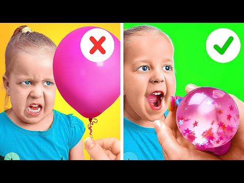
An example of a YouTube video thumbnail featuring flat, neon, fun, and bright background
While it’s easy to rack up viewers in so little time with a fun background, you must take care to prevent the deeper colors from blending into the foreground object on the thumbnail. You could also try different levels of transparency to get inventive.
9. Arrows and Circles
Most of you must have seen conspiracy thumbnails doing rounds on YouTube with bizarre circles and arrows. This is one of several innovative ways to get people to click the thumbnail.

An example of a YouTube video thumbnail featuring a controversial topic and object circled in red.
You also see these arrows and circles on sports content, pointing viewers to game moments or players on the far side. There are interesting variations to this style of thumbnail strategy that you can try too.
10. The font trick
The key to using text smartly in your thumbnail is to build curiosity without revealing a ton of information in one breath.
Nobody likes a thumbnail that is text-heavy and lacks visual cues. Try using catchy phrases that don’t overflow onto several lines. That way, you’ll have just enough material to convince viewers to take the next step but don’t use just about any font you can get your hands on.

An example of a YouTube thumbnail featuring subtle colors with enough info to know what the video content is all about
Experiment with text that is visible when users are standing a bit away from their desktop or mobile screens. A good example of this is Jeremy Ethier’s videos with over 3.5 million subscribers. By using memorable colors and more robust designs, your thumbnail could indeed influence with as little fuss as possible.
Importance of YouTube Thumbnails
Thumbnails are essential on video content, and YouTube recognizes this importance because that’s how your video gets judged in the first 15 seconds.
1. Create kickass first impressions
Think of how people search through YouTube videos to find the one that they would love to watch. This whole ‘browsing’ process includes two factors:
- An attention-grabbing title or headline
- A curiosity-building thumbnail
Once you’re done watching a video, you’ll see another creative thumbnail as a suggestion, which intrigues you to click, followed by a few more. That’s how we all end up watching videos for hours and hours.
YouTube video thumbnails play a crucial role in grabbing attention. Here are a few things to follow when thinking of designing your thumbnail:
- Image selection: Try to use a vibrant and clear image that looks just as good on small or large screens. The thumbnail image should relate closely to the info or message that you want to convey through your video.
- Photo composition: Make sure to follow the ‘rule of thirds’ to compose dynamic and interesting thumbnail images. Keep the background attractive: Choosing the right background image makes the information stand out to your audience without making it distracting. Keep the background either plain with a nice, neutral or dark color with text color complementing it.
- Background image overlay with text: To enhance YouTube's thumbnail background image, it’s always good to overlay them with descriptive and branding text. Be careful of the font and the colors that you use. Keep it readable.
- Use colors that grab attention: For a YouTube video thumbnail to be attractive and practical, make sure to use colors that go well with your video. Follow a pattern. Add bright colors that pop up but at the same time, introduce your brand elements like the color, font, logo, etc.
- Take inspiration from others: See what others are doing in the same category and take inspiration from people who have remastered thumbnail strategy to see a dramatic rise in click rates and add a flair of your own to make yours stand out.
- Make your YouTube channel recognizable: If you check out some successful YouTube videos, you will notice that they use either brand elements or certain icons, characters consistently throughout their thumbnails. When viewers see the thumbnail, they instantly recognize who the channel belongs to. This is a good trick to help your viewers register your brand name and build a strong connection over time.
2. Be consistent and build relevant context
We cannot overstate the significance of YouTube thumbnails. Truly, they can either make or break the success of the videos. If you have YouTube videos that are not generating desired results, it is high time to follow a few best practices to ensure they are optimized.
- Be consistent with publishing videos: Publishing YouTube videos consistently is more like hanging out with friends. You hang out more often, and you get closer to those friends. With consistent publishing, you have a higher chance to learn about YouTube’s algorithm and your channel in-depth. Both of which are important for your channel’s growth.
- Keep the video thumbnails & titles relevant to the context: Often, we come across YouTube titles and thumbnails that are in no way connected to what’s shown in the video. This puts the audience off. Before you know it, people have moved off from your video and jumped to another channel that has posted the right information. Review your content if you’ve made the same mistake and update it with the right details.
- Engage the audience with the right info: Besides keeping your titles and thumbnails relevant, make sure that they are precise, engaging, and catchy. Check if they reflect your target keywords or present content strategy. If they don’t, it’s time to change things. Keep the thumbnail text and video titles appealing to the searchers. Avoid stuffing keywords. Instead, use funny, descriptive, or exciting words to entice your viewers to click.
3. Leverage video SEO
You can’t go wrong with what the thumbnail shows versus the actual content because YouTube has zero-tolerance for clickbait, and if your video can’t deliver value in under 30 seconds, it gets tossed out in no time.
Plus, a good thumbnail will tell viewers what they need to know about your video without even clicking it. So to hold more audience and rescue your videos from falling out of the race, make sure everything in your video is relevant. Most importantly, following the best practices for YouTube thumbnails helps with SEO (Search Engine Optimization).
According to Semrush, optimizing your thumbnail helps your video to rank on Google SERPs. If you’ve optimized your content well enough, your video content might be in the featured snippet, positioning in the exact timing concerning the query the user searched for.
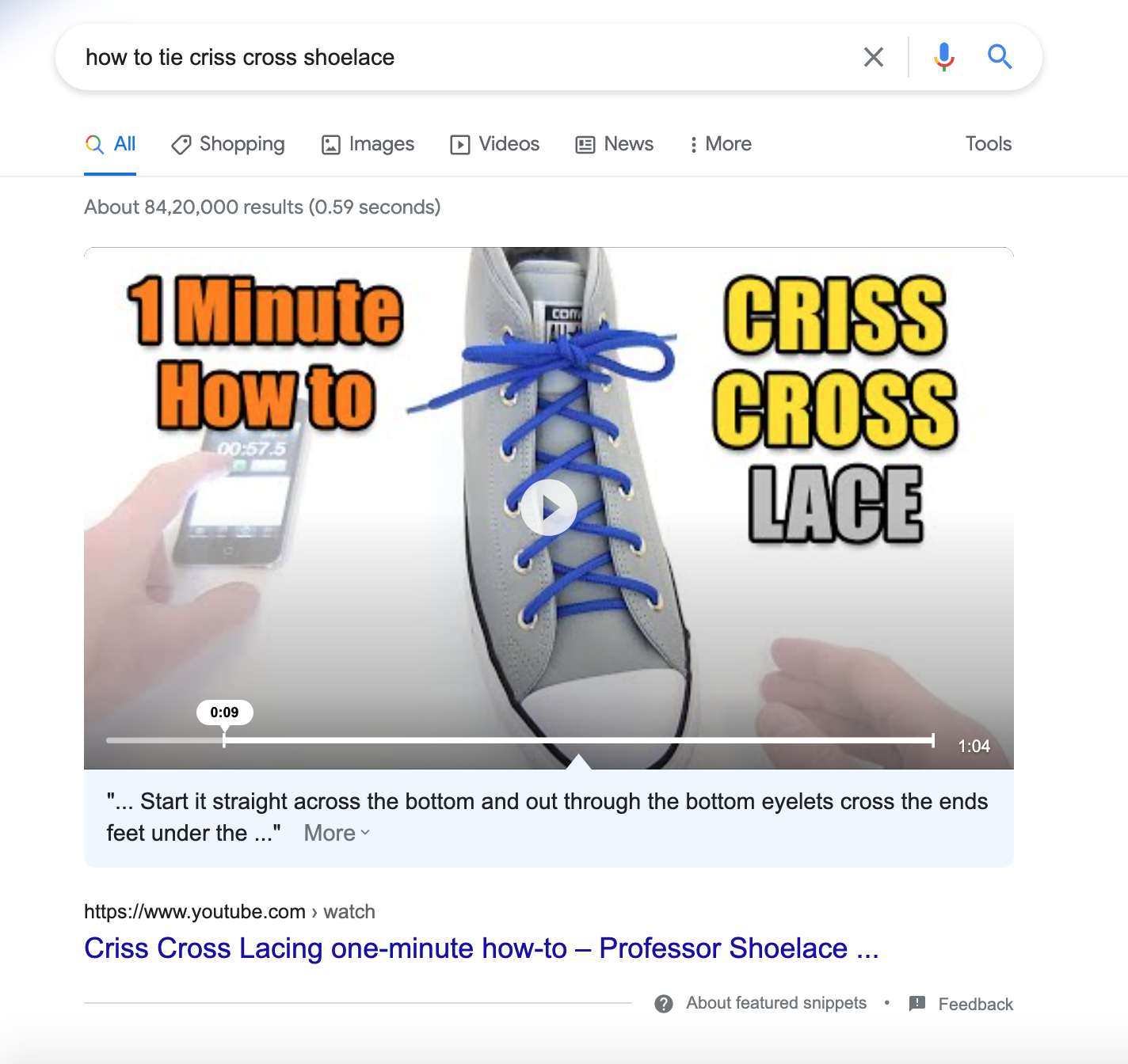
An example of a YouTube video thumbnail showing up on the Google search results for a search term
In a nutshell, make sure to create thumbnails that are relevant to your video content and eye-catching at the same time.
Conclusion
If you’ve made it this far, then all of the pointers covered above should help you segue from the traditional approach to the current best thumbnail practices. While creating a click-worthy video is one thing, getting a thumbnail to look clickable is another.
Create stunning videos within minutes!
Create YouTube videos that drive engagement, views, and subscribers. Typito’s online YouTube video maker is easy to use and lets you make videos that amplify your brand. From managing the aspect ratios of the videos to adding music to stylized text captions to adding auto-generated subtitles to defining your brand, we’ve got you covered.


