We launched a new dashboard experience on Typito! Now let me tell you the story of how we went about revamping the dashboard on the tool.
Not so long ago...
One of Typito’s power creator, who has around 3000+ projects in his account, reached out to us, talking about how difficult it is to find a particular project, in a home page stuffed with projects. Just a project preview and name and to go by, ignoring the aspect that we forget to set meaningful project names from time to time. I could empathize with how strenuous it was to search for a particular project. I too intermittently faced similar challenges in looking up my own projects on Typito even when there was only a fraction of the number of projects this user had.
I decided to scrutinize Typito’s home page, to come up with the challenges that it poses towards the users.

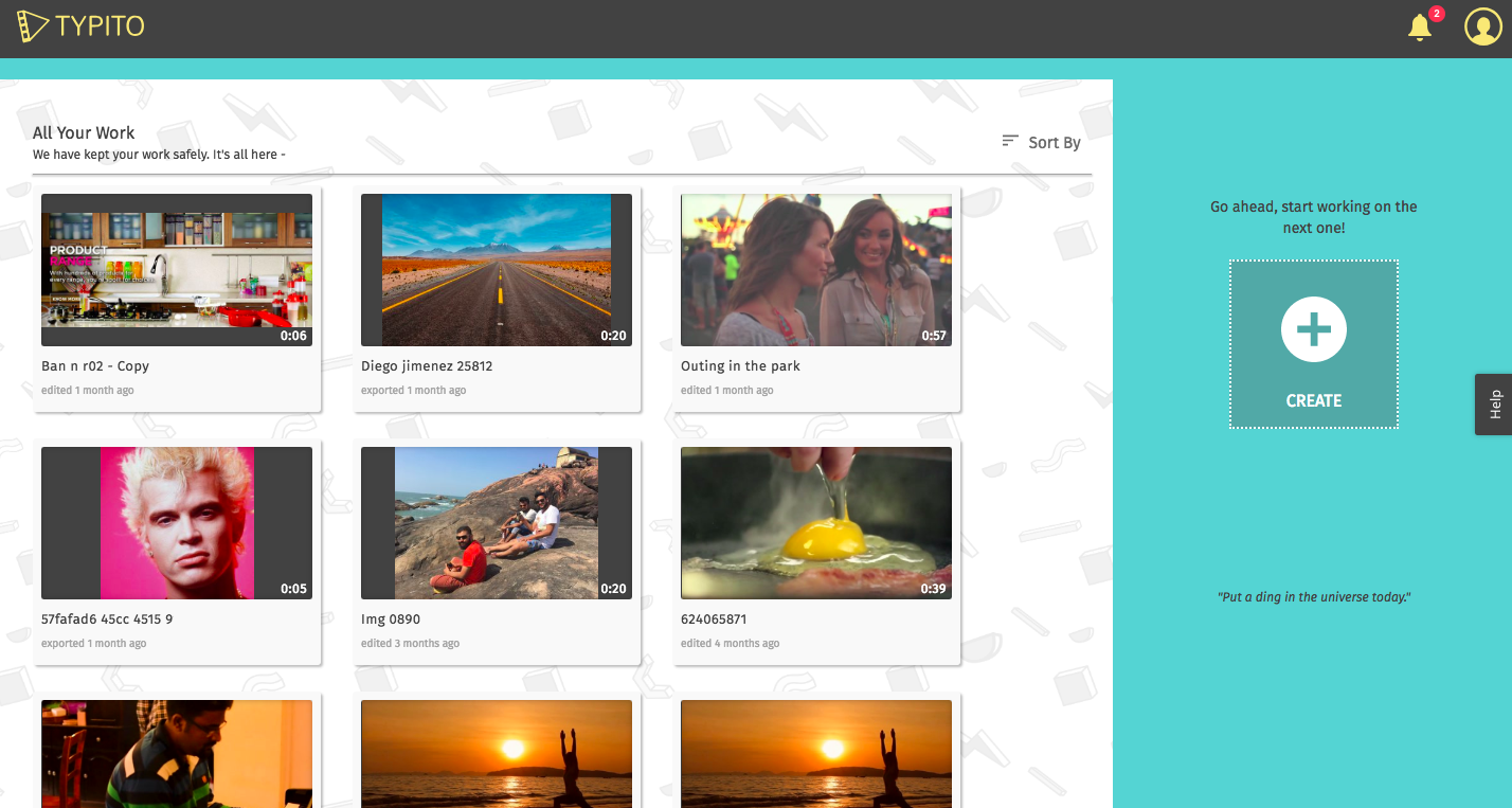
Old Typito Dashboard
Here are some of the problems I uncovered:-
- A poor layout that just dumps projectsThe first thing I realized, is that there was no order of navigation. It was just a list of projects shown on a page. There was no spatial design to segregate things to focus on and where to look for them.
- Difficult to search for projectsIf you have more than a 100 projects on Typito and you need to revisit your projects often, you’ll understand what I am talking about. The layout was not appropriate for regular creators, who had accumulated a substantial number of projects over a period of time. The sorting feature only helped so much but when it came down to looking for a particular project, it wasn’t an easy task.
- Project Tile UI was not intuitive
The Project Tile UI had project actions which showed up when you hover on them. This made triggering even the most used actions a two-step process (hover -> click). The options were:-
- Edit
- Preview (if the project has been exported)
- Copy
- Delete
- High loading timeThe old dashboard took some time to load depending on the number of projects.
The Fix
We sat down to brainstorm solutions to these issues and came up with solutions to the problems faced by the users.

The New Typito Dashboard
- A better layout
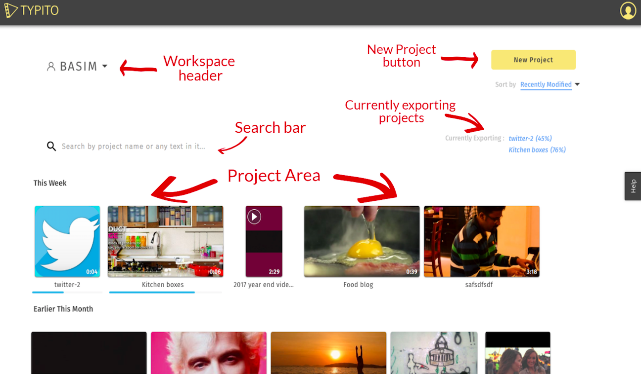
The new dashboard is divided in the following key areas :
- Workspace header
- New project button
- Sorting selector
- Currently exporting projects
- Search bar
- Project area that contains all the projects
All these areas are spaced out to let the user focus on the one he needs.
- Improved Tiles
- The shape of the tile indicates the current aspect ratio of the project. Square tile for square videos, vertical for mobile videos, and a rectangle for widescreen videos.
- Clicking anywhere on the tile takes you to the edit page of the project.
- If a project is currently exporting, there is a progress bar at the bottom of the tile to indicate the progress of the export.
- If a project has a exported preview available, it shows a play button in the top left corner, which takes you to the export page.
- Hover over the tile to see a options button, which contains options for duplicating a project and deleting a project.
- Project GroupingProjects are shown in a grouped layout, to let you focus on the ones which matter. They are grouped either chronologically or alphabetically depending on the type of sorting you have chosen.
- SearchThe biggest challenge with the old dashboard was searching for a project. We introduced a search feature on Typito to target that problem. You can search not just by project name but also, any text that you added in a particular project. This was done to tackle the problem that people don’t usually name their projects appropriately. So if you remember any text you added, we will find the project for you.
- Currently exporting infoOnce you’re done editing a project, you need to export it to get the project. Exporting is a time consuming step and the user needs to wait for it to complete. However, you don’t need to keep the exporting window open while the export is happening. You can close the tab, the export keeps running in the background. To indicate the currently running exports, we have dedicated a section on the Dashboard so that the user can track all his exports from one page.
- Improved loading timesThe load time of the new dashboard is blazing fast now and more-over it does not vary with the increase in the number of projects in your account.
If I have to pick one feature!
In my opinion, the most useful feature in this upgrade is the Search anything feature. Initially, we had only planned to have a search by project name which was a useful feature in itself. During one of the many brainstorming sessions I had with Srijith, he suggested the feature to search by any text in any project. This feature is really powerful as you don’t need to memorise the names of your project and can find your projects almost instantaneously.
Your feedback is what keeps us moving in the right direction. Do let us know which is your favourite feature in this upgrade.

